Here are a couple of 10-year charts to help put things in perspective.
Click Charts to Embiggen
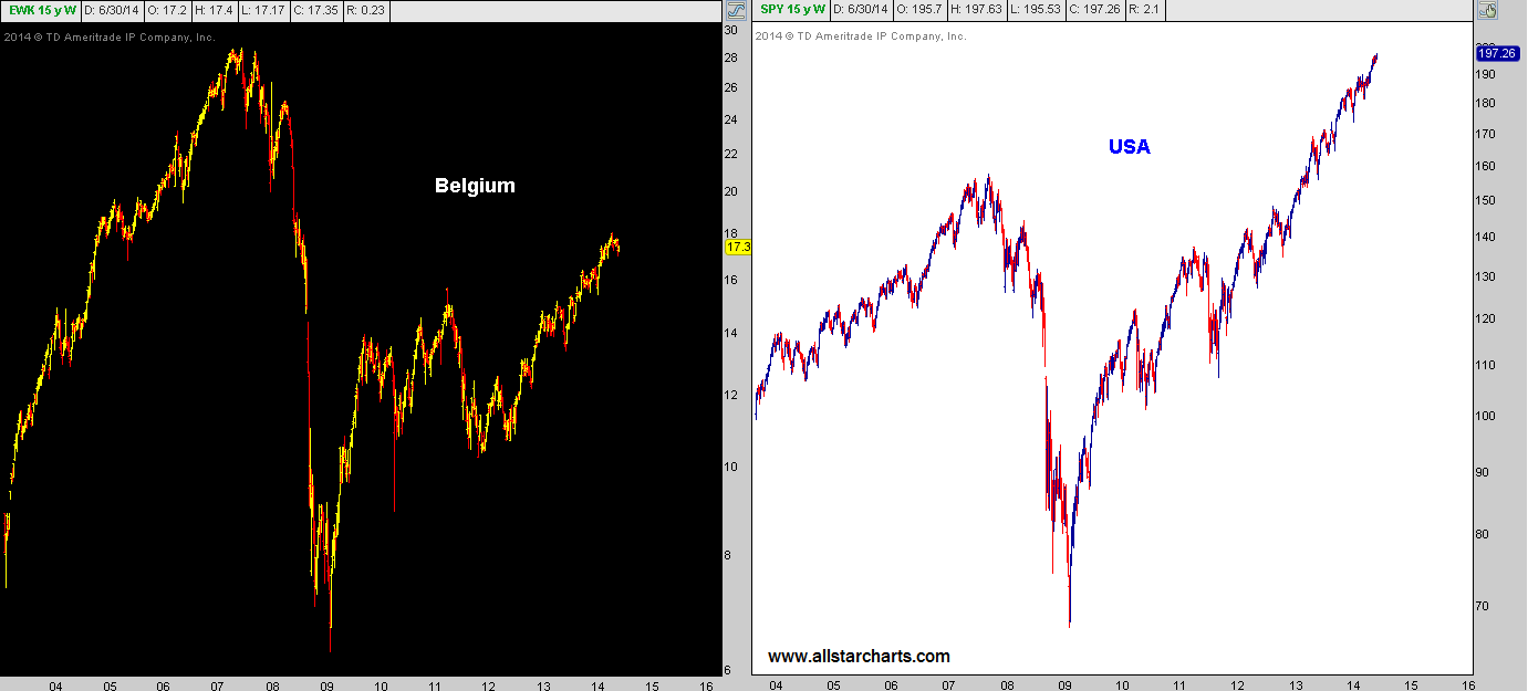
Any questions?
Tags: $SPY $EWK
Expert technical analysis of financial markets by JC Parets
Here are a couple of 10-year charts to help put things in perspective.
Click Charts to Embiggen
Any questions?
Tags: $SPY $EWK
Of all the TV and Radio that I do every month, this is without a doubt one of the most enjoyable for me. I really appreciate a show that is dedicated to analyzing the behavior of the market and market participants. They get it.
Here is the interview in full:
REGISTER HERE for more information on how to access the charts mentioned on a weekly basis.
Tags: $SPY $IWM $ES_F $SPX $EUFN $FEZ $XLF $KRE $SI_F $SLV $DB $BCS $PA_F $PALL $SWC $TWTR $TNX $TYX $TLT $IEF $XLE $TAN $GDX
Coming into the new year, Commodities were a major theme for us on the long side, specifically the Agricultural futures. These guys did great for the first quarter and the strength continued throughout the first half the second quarter. But over the past 6 weeks or so, the Grains have gotten hit pretty hard. As prices have corrected the early 2014 gains, the “Smart Money”, or Commercial Hedgers, took notice and have started to buy Corn, Wheat and Soybeans.
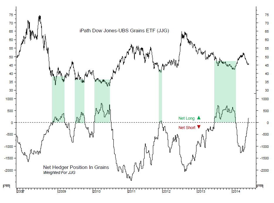
Here is a chart comparing the Net Hedger Positions in Grains with the price of the DJ-UBS Grains Subindex ETN $JJG. I find it very interesting that when the Smart Money is Net Long these names, the price of $JJG tends to bottom out and rally. We are now just entering Net Long territory after this price correction:
Click Chart to Embiggen
From Sentiment Trader:
“We also want to pay attention when they go net long a particular commodity. Because their underlying businesses are almost always naturally “long” the underlying market, they are usually selling short the futures. So when they go net long, it’s a notable event.
That’s what we have in grains now. The iShares Dow Jones-UBS Grain ETF (JJG) is the most established fund that tracks these markets. It is weighted approximately 41% to corn, 34% to soybeans and 25% to wheat. We used those weights to compute a hedger index for the futures, which is what is shown above.
It has just turned positive, meaning that hedgers are now net long. The green highlights show the other times they were net long, and we can see that each of them coincided with bottoming phases in JJG.
Unfortunately that ETF only goes back to 2007, but if we look at the underlying commodities, the hedger index was successful at most frequently highlighting bottoming phases in the grains. While we can always see some shorter-term gyrations, on a multi-month time frame we should see JJG rally.”
I don’t think that just because the Commercial Hedgers are net long, we should dive in head first without any risk management strategies. But I think it’s a space that is worth looking into a little closer. The $JJG owns Corn, Beans and Wheat. If $JJC gives us a nice risk/reward entry point, then we can execute a position. How and when to enter depends on your time frame and risk parameters. For us, right now today is not that time. But I think we’re really close.
***
REGISTER HERE for weekly updates on each of these commodity charts with comments and annotations using multiple time frames.
Source:
Daily Sentiment Report June 27, 2014 (Sentiment Trader)
Tags: $JJG $CCI $ZC_F $ZW_F $ZL_F $WEAT $CORN
This is a stock that definitely used to get a lot of hype but lately the noise surrounding it has quieted down. We like that. After a 30% rally from last month’s lows, prices are now approaching that key $40 level that had previously served as support twice last November and again in April. On the first day of technical analysis kindergarten we’re taught that former support should turn into resistance. But through experience, I have since learned that if prices break through that potential resistance without much hesitation, an epic rally can develop quickly.
Here is a daily chart of $TWTR since the November IPO. It’s easy to see the former support and what could/should theoretically become overhead supply. My question is, What if it doesn’t?
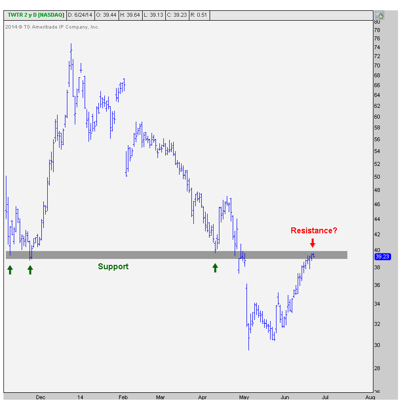
What if we blow right through this level? What if the overhead supply right here doesn’t cause much trouble? What if we get a gap higher above this level? What if we pull back a bit and then break through? (most likely outcome in my opinion) <– All of these would be really bullish developments.
The scenario doesn’t get much cleaner than this. We have our levels. We want to be long only above that former support, and below that level we don’t want anything to do with it.
Here is another look at this chart but with two trendlines from the top. The good news here is that we are clearing what looks to me like two important trendlines. The bad news is that we’re still not through this overhead supply. But the levels are clear:
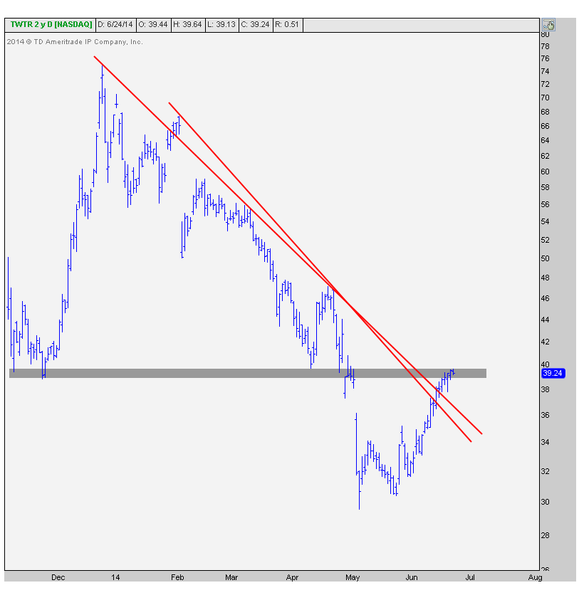
Price target-wise, if we can get going, the first target is between $47 and $51 which represents the 38.2% Fibonacci retracement from the entire 60% decline since the end of December. This area is also where prices ran into resistance after the IPO and again in April. Look how it also served as brief support in February. So this seems like a logical level to take some initial profits and reevaluate the entire situation. At that point, we want to ask ourselves: How did we get there? How was momentum? How was relative strength? etc. And then we can decide whether to call it, let it consolidate first, or stick with the entire position.
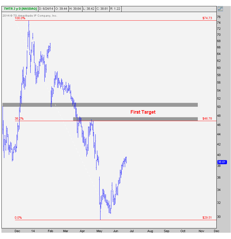
This chart gives us a quick 17%-27% target upon confirmation. I like it when my charts are clean like this and the risk is well defined. If and when we get through this overhead supply, we’ll be all over it. Until then, it’s just a waiting game….
***
REGISTER HERE for more information on how to access updated charts on these popular ticker symbols with annotations and commentary on a weekly basis.
Tags: $TWTR
Back in early March we noticed some interesting developments in shares of JC Penney. Due to a combination of failed breakdowns on multiple time frames and a bullish momentum divergence, we figured $JCP would rally 30%. Over the next 10 weeks or so we got that move exactly. But after further review, I think we can now see the next leg higher, at least another 30% rally from here.
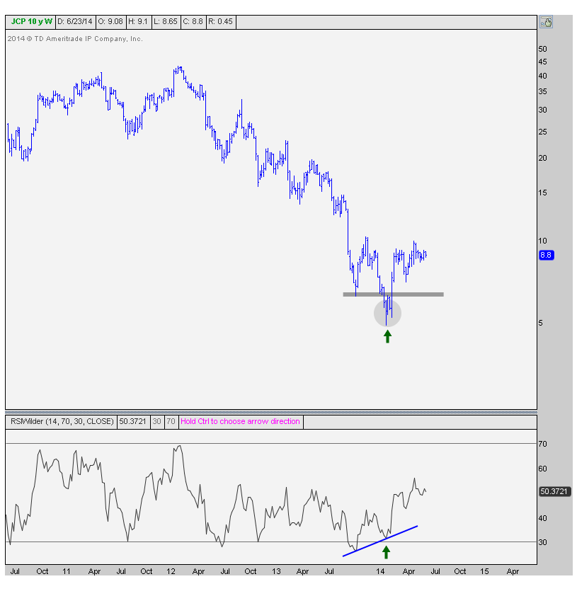
This is the same weekly chart that caught our attention the first time around back in March. We’re looking at the weekly bars showing a bullish divergence in momentum. We tend to pay more attention to these when they come on longer-term time frames. Notice the lower lows in price into January while the 14-period RSI was simultaneously putting in a higher low:
The next chart represents the daily candlesticks along with the 50 and 200 day moving averages. Look how prices have continued to consolidate sideways after hitting our initial 30% target. After a big rally, prices can correct in one of two ways: through price or though time. The more bullish correction, in my experience, has been when prices correct sideways to allow smoothing mechanisms to catch up, rather than correcting down to meet the mean:
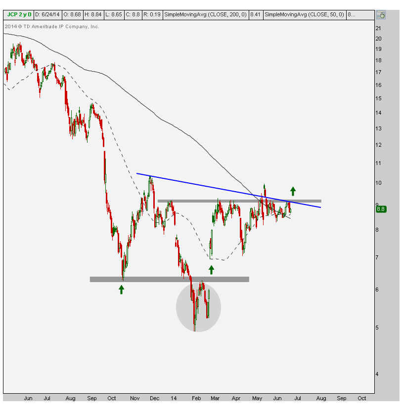
I think a breakout here above this downtrend line (blue) and horizontal resistance (grey) would be the confirmation we need to signal that the next leg higher has begun. After a failed breakdown this massive (grey circle) and bullish momentum divergences on multiple time frames, we have to continue to give the bulls the benefit of the doubt. But the entry point, in my opinion, is only above this resistance. I’d prefer to only be long above 9.25-9.30. Below that and I would remain in the neutral camp, as we’ve been in since hitting our initial target.
This is actually a great example of being disciplined and backing off after hitting our initial targets. Also, this is another reason why we set “initial” targets, even though we might think we can see much higher prices in the stock. I think this squeeze can continue. We just waiting for the breakout. I would love it to come on a gap up higher, like we did in late February, but now we’re just getting picky. Let’s take what we can get.
I’m looking at that support from last August/September that ended with a gap lower on September 25. The next target is up there to fill that gap. The last report showed close to 30% of the float is still short. I’m curious to see how that has changed once the new numbers are released, but in all likelihood, not much has changed on this front. The shorts are still getting squeezed, and things could be about to get a lot worse for them. We’ll see.
Make sure to follow me on Stocktwits and Twitter for follow up commentary on this name.
***
Also REGISTER HERE for more information on how to access these charts on multiple time frames on a weekly basis.
Here is the video I did on Fox Business March 3rd talking about the strategy behind the initial trade and how we would reevaluate once our targets were met:
Tags: $SPY $JCP
Latin America has been one of the worst performing areas of the world since it peaked in 2011 with a lot of the metals and mining companies. The countries that make up the Latin America 40 index have a lot of exposure to that space so they tend to behave in a similar fashion. More recently, the index has been forming what looks to me like a falling wedge pattern. A breakout clean above this formation would trigger the beginning of a new trend, which could mean some serious changes in money flow.
Here is a weekly bar chart of the Latin America 40 ETF $ILF. Look at the falling, converging trendlines in red that define the upper and lower boundaries of the wedge. Also notice that support earlier this year came right at the 61.8% Fibonacci retracement from the entire 180% rally from 2008 to 2011. What I love about this pattern is the brief whipsaw below both the lower trendline and 61.8% retracement level before quickly reversing back in to the 3-year pattern. We often see failed breakdowns like these lead to vicious breakouts in the opposite direction:
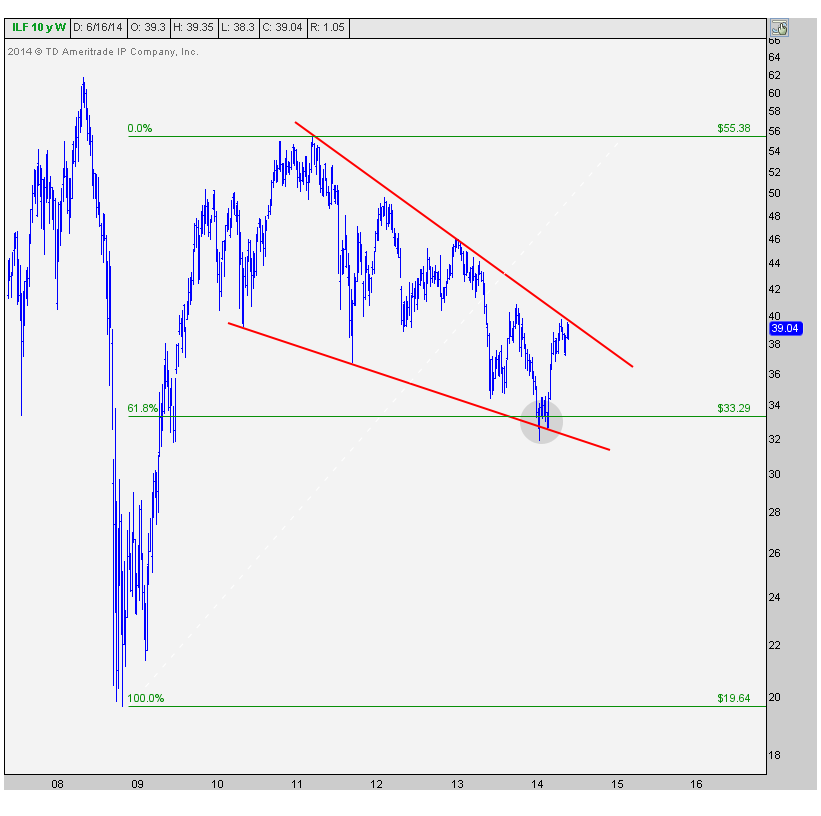
Although a breakout above the upper downtrend line would be a bullish signal, I would feel much more comfortable calling this a new uptrend once we take out the October highs. This would be the first higher high, from a structural perspective, in years. I would then consider this to be extremely constructive for Latin America and the unanimously hated metals and mining space as a group.
Now looking at momentum, it appears as though that low earlier this year coincided with a bullish momentum divergence. While prices were making a lower low (the “failed breakdown” mentioned above), momentum as measured by a 14-period RSI was putting in a higher low. Here is a closer look at the weekly bar chart above showing the bullish momentum divergence in Latin America:
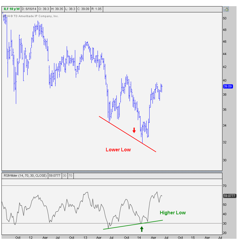
Long time readers know how much I respect a momentum divergence this massive, especially on a weekly time frame. These longer-term divergences often ignite powerful moves in price that can last a long time.
Finally here is a shorter-term look at these recent developments, but this time using daily candlesticks and a 200 day moving average. Look how prices exploded higher once they got them back above last summer’s lows. That squeeze could definitely the beginning of something bigger. Look at the 200 day moving average now turning higher. As mentioned earlier, I would still feel more comfortable calling this a new uptrend once we start making higher highs above the October peak:
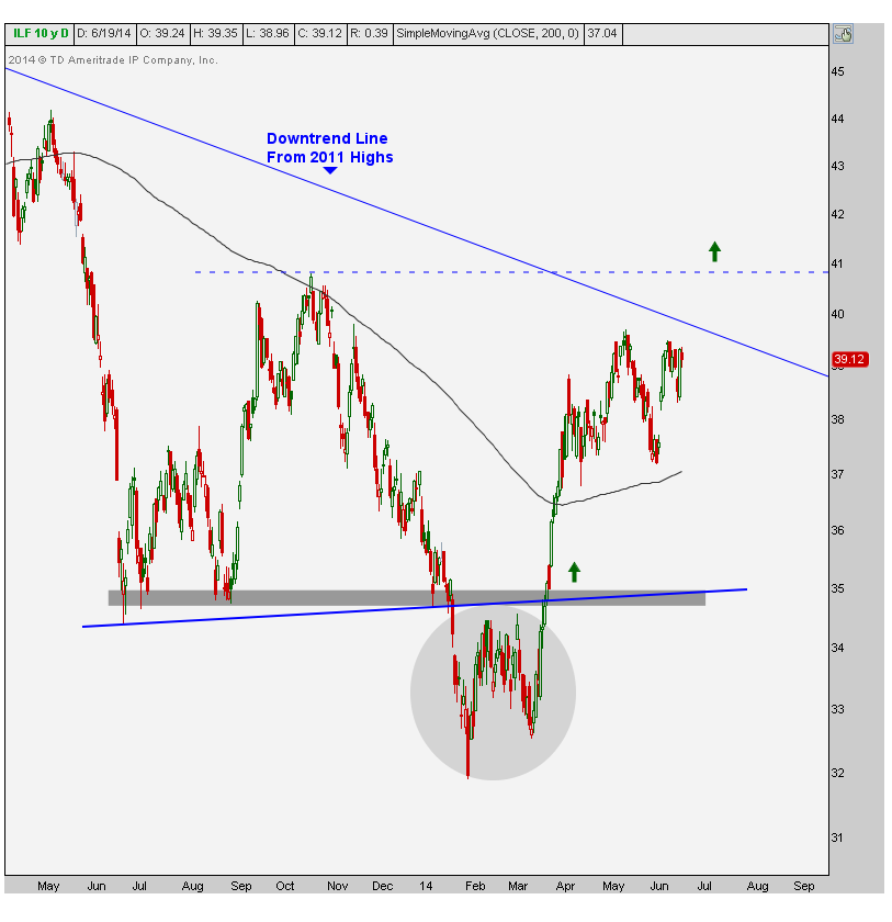
There isn’t really anything for me to do here personally execution-wise, because it doesn’t exactly fit my time horizon and risk parameters. To me, this is just an interesting development that could lead to a monster position in either the Latin America 40 Index, or one of its components, whether it be Chile, Peru, Brazil or otherwise. But we’re all different in terms of our goals, so this might be actionable for someone else. I can’t make that decision for you.
Either way, I’m fascinated by what’s happening in this market. There are a lot of frustrated participants here as the developed nations race to historic highs and this market is still almost 60% away from getting back to the 2008 highs. What do they say? “One man’s trash is another man’s treasure”? I try my best to keep an open mind, but I can’t help but find these developments to be incredibly intriguing.
Stay tuned….
***
REGISTER HERE for more information on how to access all of the Latin American Index Charts on multiple time frames including Mexico, Chile, Peru, Brazil and Colombia on a weekly basis.
Tags: $ILF $EWW $EPU $ECH $GXG $EWZ
This is one that I’ve been watching for a while. We’ve seen a beautiful consolidation in this name over the past 8 months that turned Nokia into a “boring”, rarely talked about name. But I think the next leg higher just got going. We are currently breaking out above a very important level.
The first chart helps to put things in perspective. These are the weekly bars going back to the top in 2007. Look at the support near $8-8.50 from early 2009 and again in summer of 2010. Once the demand dried up at this level, you got a vicious breakaway gap lower in May of 2011 that sent the stock down another 80%. This was quite the accomplishment considering Nokia had already gotten crushed by 80% since 2007:
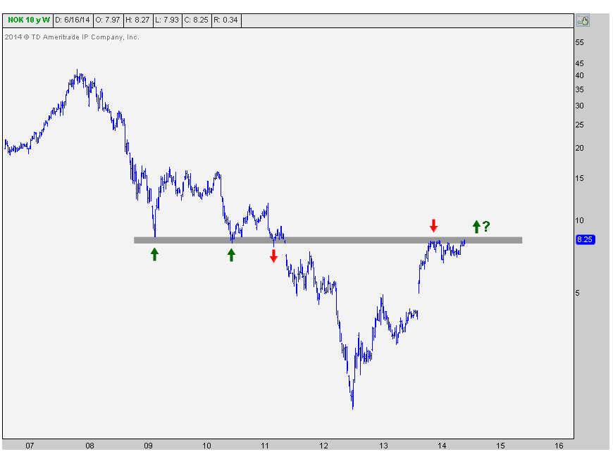
But now we’re back. The stock has rallied all the way back up to that key broken support from 2011. There is a ton of memory here. I would chalk this up as the reason why Nokia has done nothing for 8 months and just consolidated sideways up here at the $8-8.50 level.
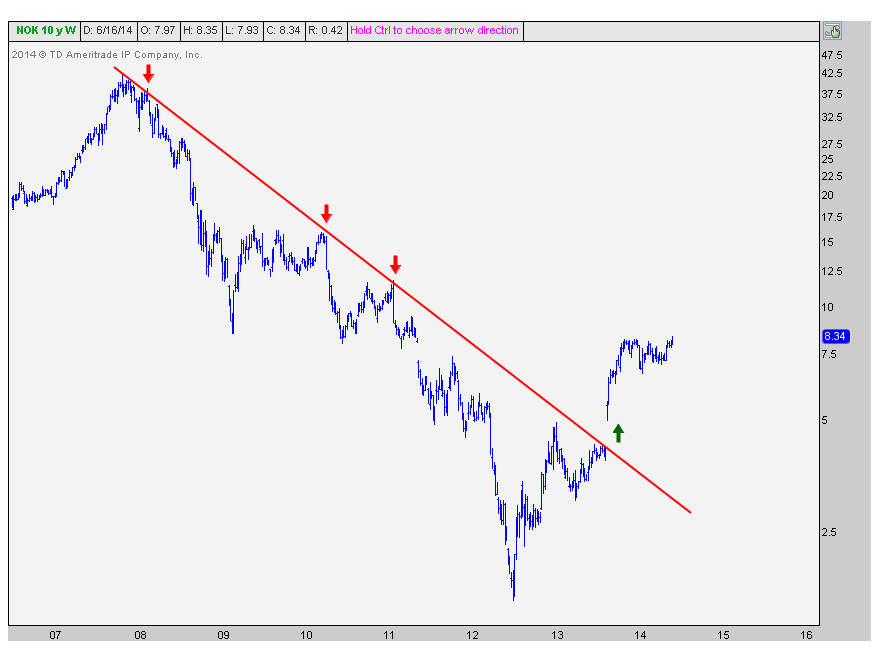
Now here is the downtrend line from the 2007 highs, not only getting taken out the upside last Fall, but it took place on a sweet breakaway gap higher. That combination of a breakout above a trendline and a gap up to accomplish it really catches my attention:
The last chart is a closer look at the shape of the recent 8-month consolidation mentioned above. It’s really taken the form of a symmetrical triangle well defined by these two converging trendlines. This month’s breakout can be the beginning of something powerful. This is especially the case when you consider the extremely upward sloping 200-day moving average (solid line) and 50 day moving average (dashed line). With upward sloping longer and shorter-term smoothing mechanisms, the breakout above this consolidation becomes more reliable. These resolutions tend to be in the direction of the underlying trend, which in this case is obviously higher:
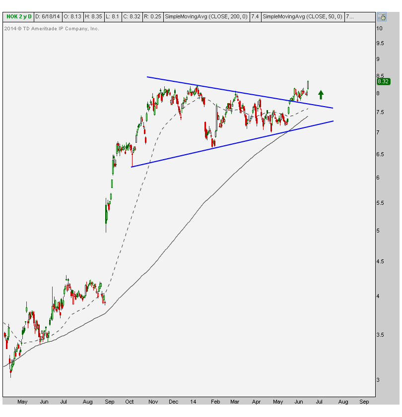
So how high can Nokia go? I think it’s got a lot of room. We really only want to be in this name above the recent consolidation. If this fails and gets back below the breakout level seen in the chart above, we probably want to shy away and reevaluate. But as of right now, this all looks great. The risk reward here is clearly in favor of the bulls. I see a ton of resistance around the 16 level that takes us back to the overhead supply from 2009-2010. That would put Nokia close to twice the current price. From a shorter term perspective, the 2 point size of the base of this consolidation would give us a measured move about 20% from current levels. Also not a bad return.
We only like this name above this breakout level. Below that and things get messy. So from a risk management standpoint, Nokia is an easier trade than a lot of other things I’m looking at. In addition, according to my friend Jonathan Krinsky over at MKM Partners, only 26% of sell side analysts have a buy recommendation on Nokia. So this creates a very attractive long position from a contrarian point of view.
I’ll try and follow up with the progress of this chart very soon.
***
REGISTER HERE for more information on how to access updated charts for these widely followed stocks on multiple timeframes.
Tags: $NOK
One of the most fascinating developments over the past 3 years has been this incredibly tight range-bound market that we’ve had in Heating Oil futures. I first brought this up a couple of months ago suggesting that we wait for a breakout before getting all excited. But I’m starting to creep into the camp that anticipating this breakout might not be the worst idea.
Normally I would say that with a base this big, we might as well just wait for the first higher high before entering. The old saying is, the bigger the base the higher in space. Meaning, that the longer it takes for a base to build, the longer the ensuing trend should last. We’re now going on over three years of this base. Look at this thing:
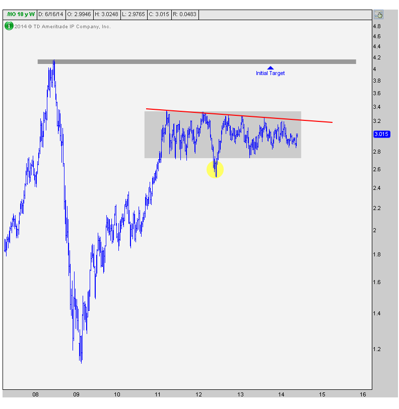
These consolidations tend to resolve themselves in the direction of the underlying trend, which in this case is up since early 2009. So I’m inclined to anticipate this breakout a bit as long as prices remain above 285. This level represents the recent lows in the second quarter. Below that price things get messy and would suggest that somehow even more time is necessary to complete this base. Otherwise, I think a breakout is coming soon.
You see, what happens is that in a tight range like this, nobody wins. The bulls are frustrated and the bears just as much. So market participants just start throwing in the towel and they move on to something else. But when the consolidation eventually resolves itself, all of that built up demand gets exposed and that’s when they start to rip them higher. I think this is precisely what we’re seeing here.
I love this market. I love the fact that there is essentially zero correlation with the US stock market. This really helps with diversification. Because obviously the last thing we need is another correlated asset.
Whether you anticipate or wait for a breakout is all up to you, your time frame, and your risk parameters. Whether you use futures, options or ETFs is another decision that we need to make depending on who we are and what our goals are. This post is simply to point out the massive base that has developed in this market. I just want to reiterate that this is easily one of the most fascinating developments in the world. As you guys know I look at all global stock markets, commodities, currency crosses, bonds and individual equities. This one excites me most.
***
REGISTER HERE for more information on how to access all of the Commodity charts with commentary updated on a weekly basis
Tags: $HO_F $UHN


