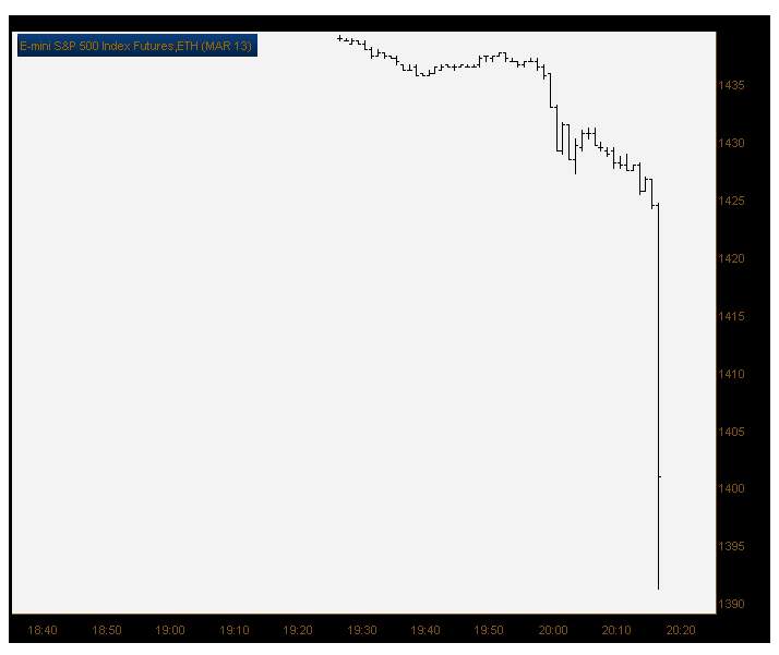
Here’s what the E-mini S&P 500 Index futures did at 8:18 PM Thursday evening:
Tags: $ES_F
Expert technical analysis of financial markets by JC Parets
Here’s what the E-mini S&P 500 Index futures did at 8:18 PM Thursday evening:
Tags: $ES_F
How about that for a headline?
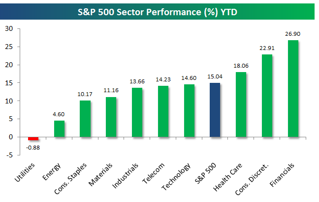
The financials, banks, $XLF, broker dealers, or all of the above. The group they call, “The Financial Sector”, has led the United States stock market higher for the year. Tell me the capital markets aren’t awesome.
I have conversations with random non-market professionals all the time. And to this day, if I tell them I’m buying banks, they get this disgusted look on their face, “Really, financials? Why?”. I tell them, “there’s one reason why – look at your reaction”. All those disastrous banks blowing up was over 4 years ago. Do you know how long that is in internet years? Instagram didn’t even exist yet.
Sentiment is a powerful thing. And it’s our choice whether to take advantage of it or not.
Bespoke Investment Group has a timely post up today showing the sector by sector performance for 2012. Financials are up almost 27% and leading the way higher for the market in 2012. How about that?
Last week an accountant friend of mine came by the office and was looking over my shoulder at my monitors. I had a chart of Spain up and told him we were buying $EWP – the Spain ETF. He had the same disgusted look on his face that I’ve seen many a time when bringing up a long financials position. Coincidence?
Source:
You might think that the Nasdaq has been lagging some of the other major US equity averages lately. And after a quick glance at the Nasdaq100 ($QQQ), it’s a fair point. But remember that this disaster of an Apple stock is close to 20% of that index. Apple lost almost 30% of its value in just 3 months. I guess the 100B in cash and “low” p/e ratio wasn’t so important after all.
Now, looking at the Nasdaq100 in a different way, it actually turns out that they’ve been the leader. While the Dow Jones Industrial Average, S&P500, Russell2000, and Midcap400 are still below their September highs, the Nasdaq100 Equal Weight ETF ($QQEW) is already challenging those highs.
So basically, if you take $AAPL’s monster weighting out of the equation, the Nasdaq100 looks great:
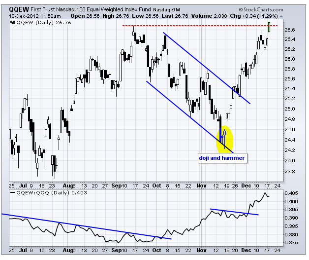
Look at the lower window in the chart. How about that outperformance in the Equal Weight Nasdaq100 since the $AAPL destruction began?
We can have a long philosophical discussion about price and cap weighted averages. I have my feelings on that, like $IBM being the most important stock in the Dow Jones Industrial Average while Alcoa is almost irrelevant. But that’s a topic for another blog post.
Sources:
Equal Weight Tech ETFs If You’re Shy About Apple (ETF Trends)
Nasdaq100 Equal Weight ETF Breaks September Highs (StockCharts)
PowerShares QQQ Holdings (YahooFinance)
Tags: $MDY $DJIA $SPY $IWM $AAPL
Mary Ann Bartels, technician at BofA/ML, is out with her 2013 outlook. Although she is still bullish equities going into early next year, she points to three reasons why there is a risk of a bear market in excess of a 20% decline beginning in 2013.
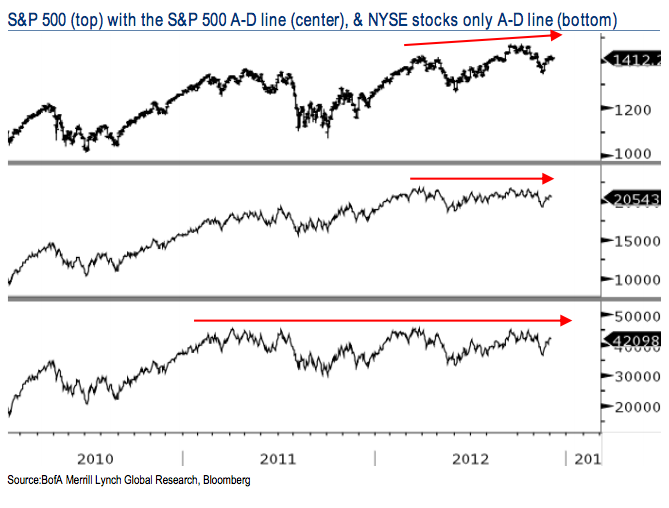
The first is the divergence in the advance/decline line. While the S&P500 has made new price highs, the advance/decline line for both the S&P500 and NYSE has remained flat:
Her next concern is the Presidential Cycle. The month of February after an election is often down sharply, on average by 2.3%. Based on historical trends, the post-election year is usually the weakest period of the four-year presidential cycle:
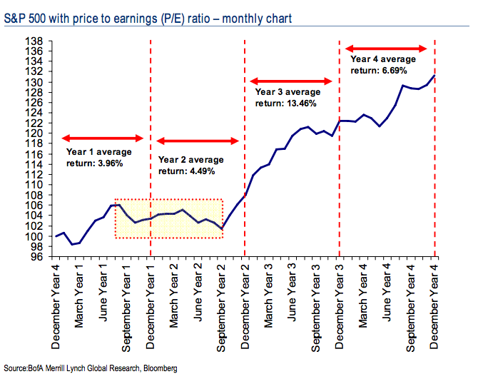
And finally, the shelf life of a 20%+ bull market in stocks is usually about 2.5 years. If you consider how far we’ve come off the 2009 lows, 2013 would mark four years of this expansion in the stock market. So she thinks that it’s about time for a change in direction.
Personally, I can’t say that I disagree with most of this stuff. The Presidential Cycle is definitely leaning in the direction of the bears. The A/D line, however, can still confirm the new price highs. But this rocking bull market is going on four years. Can you count the 2011 correction as a valid interruption of that main trend? Not sure. We did make fresh highs less than a year later. So to her point, we’ve probably been in a bull market for too long. Time for a change?
Source:
Here Are 3 Reasons Why Stocks Can Enter A Bear Market in 2013 (BusinessInsider)
Tradition has it that if you misbehave throughout the year, you might just end up with a lump of coal under the tree on Christmas morning. But going into the end of 2012, it might not be such a bad thing. In case you hadn’t noticed, the Coal sector has been consolidating in a nice tight range for almost 7 months. These narrow ranges typically resolve themselves with a vicious move one way or another. We’re in the camp that this resolution comes with a move higher.
Here is a chart of the Market Vectors Coal ETF ($KOL) in a tight range since May. The first thing that stands out to me here is the higher low that momentum was putting in as prices were making fresh 52-week lows in September. This bullish divergence in the relative strength index is clue number one for higher prices:
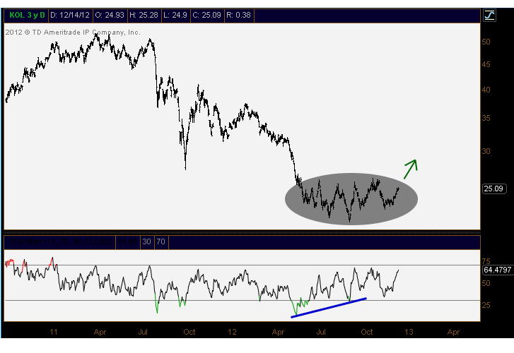
Next, we need to factor in the amount of attempts that Coal has made to get above this $26 level. It’s more of a 50-60 cent range and not an exact number, but the resistance is clear. Currently, this space is working on a 5th test of that resistance. As always, the more times that a level is tested, the higher the likelihood that it breaks.
From a risk management perspective, I’d be looking at November’s lows. We really should hang on to those if $KOL is going to breakout to the upside. A rollover there would signal to us that this space isn’t ready yet and needs some further consolidation.
So we’re watching Coal pretty closely here, and more specifically the components of the ETF itself. I think it pays to dig deeper into this space and maybe get creative with positioning and entry points. As we approach the end of the year, we’re looking at some of the areas of the market that could turn into leaders. We mentioned China recently, and I think Coal should follow that space.
Tags: $KOL $BTU $CNX $JOY $$YZC
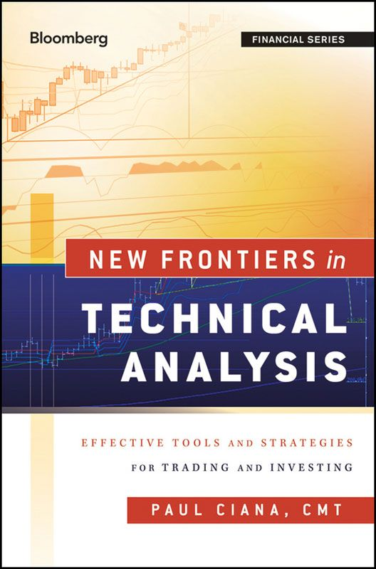
Earlier this week I had the opportunity to watch Paul Ciana, CMT give an excellent presentation at the New York Society of Security Analysts. Paul is the author of the book New Frontiers in Technical Analysis and currently serves as Bloomberg’s Technical Analyst for North America. I’ve had the chance to get to know Paul over years due to his involvement with the Market Technicians Association, and more specifically its New York City Chapter.
I wanted to share some fascinating points that Paul made after his extensive research on the charting preferences of Bloomberg users. The first chart displays the average chart-type preference of market participants from 2005-2010. For sample size, assume that for every 100 market participants, 44 were in the Americas, 38 in Europe, 12 are in Asia, and the other two are in the Middle East and South Africa (MESA)
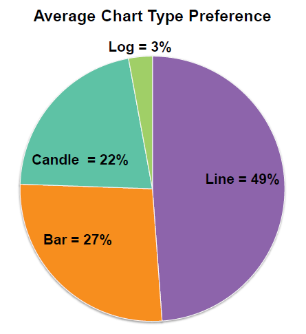
No love for the log chart…
Now look at the average preference for historical and intraday charts by market participants from 2005-2010. Notice how the historical chart is chosen more than twice as often as the intraday chart:
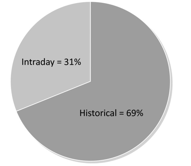
But now take a look at how the popularity of these charts has changed over the years. As time goes by, market participants care less and less about their historic charts, and are looking more at intraday time frames. I certainly can’t say that I’m surprised, but it’s definitely cool to see the stats.
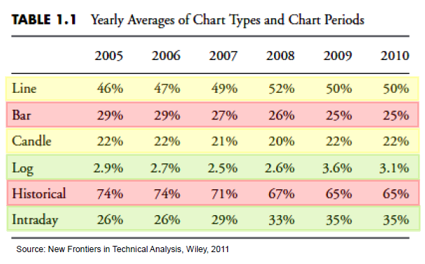
The most shocking of all of these numbers has to be the infrequency of the use of logarithmic charts. 3% really? That’s all? And what’s even more strange is that the log scale is more helpful in longer term charts. But somehow, the number of logarithmic users has actually increased while the number of historical charts viewed has decreased.
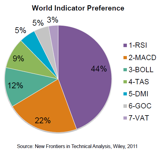
Moving over to the use of indicators, the usual suspects come up: RSI & MACD represent 2/3 of the preferred indicators. Not surprising there. But what is interesting is that Stochastics and Bollinger Bands are used by just a single digit percentage. I would have expected more. The Directional movement index (DMI), Ichimoku (GOC), and Bloomberg’s Volume at Time (VAT) round out the top 7 most heavily used indicators (outside of moving averages):
And finally, here is a graph showing these same indicators, but separated by region. Look at how much Asians love their Ichimoku Clouds:
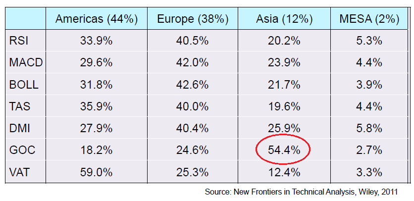
You may also notice that the preference for almost all technical indicators in MESA is more than double its sample size. This shows a strong overall preference for technical indicators in this region while the Americas substantially underperform in most categories.
I want to thank Paul Ciana for letting me show you guys some of these numbers. I thought it was so cool to see what Bloomberg users around the world using for charts. Make sure you pick up a copy of his book: New Frontiers in Technical Analysis for more of this type of data and further exploration into the world of Technical Analysis.
Source:
The folks at CitiFX are out with their annual 12 charts of Christmas. In their view, the intention of these charts is to establish a ‘starting point’ for views as we head into 2013. There’s a lot of juice in this presentation. Here are a few of the bullet points via zerohedge:
What do we believe for 2013?
- Initial claims will follow a similar path to that seen in the 1970s and begin to move higher in 2013. This will be the first indication that further trouble lies ahead. The 2’s – 5’s curve will eventually move higher also but not before posting one last move down.
- U.S. 10 year yields will have one final push down towards 1%-1.2% at which point they could bounce up like a “beach ball let go underwater”.
- EURUSD will fall towards 1.20 in Q1 2013 and possibly even 1.10-15 with parity a real possibility in 2 years. We also expect a rally on the USD Index this year of about 15% which suggests that this move will be predominately driven by EURUSD (57.6% of the USD-Index).
- USDJPY will eventually move higher as the interest rate dynamic kicks in and we would not be surprised to see a move into the low 90s over the course of the year.
- We expect Gold to move to $2,055 -$2,060 in the first quarter of 2013 a and ultimately a rally towards $2,400 in 2013.
- Crude Oil (Brent) should rally to the 2011/2012 highs around $125 and possibly move to all time highs in 2013.
- The DJIA will drop over 20% towards the 10,000-10,500 area.
A couple of the charts that I found interesting (click to embiggen):
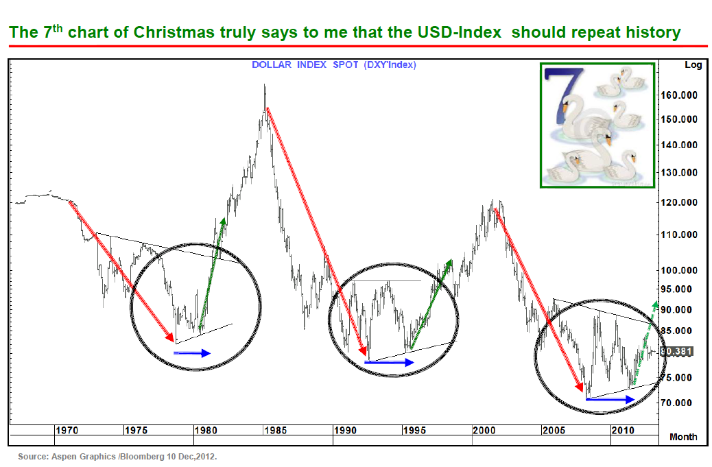
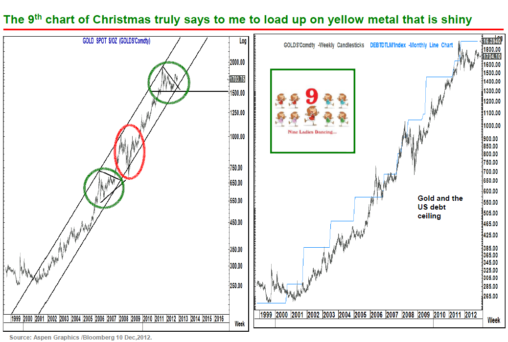
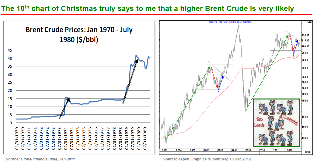
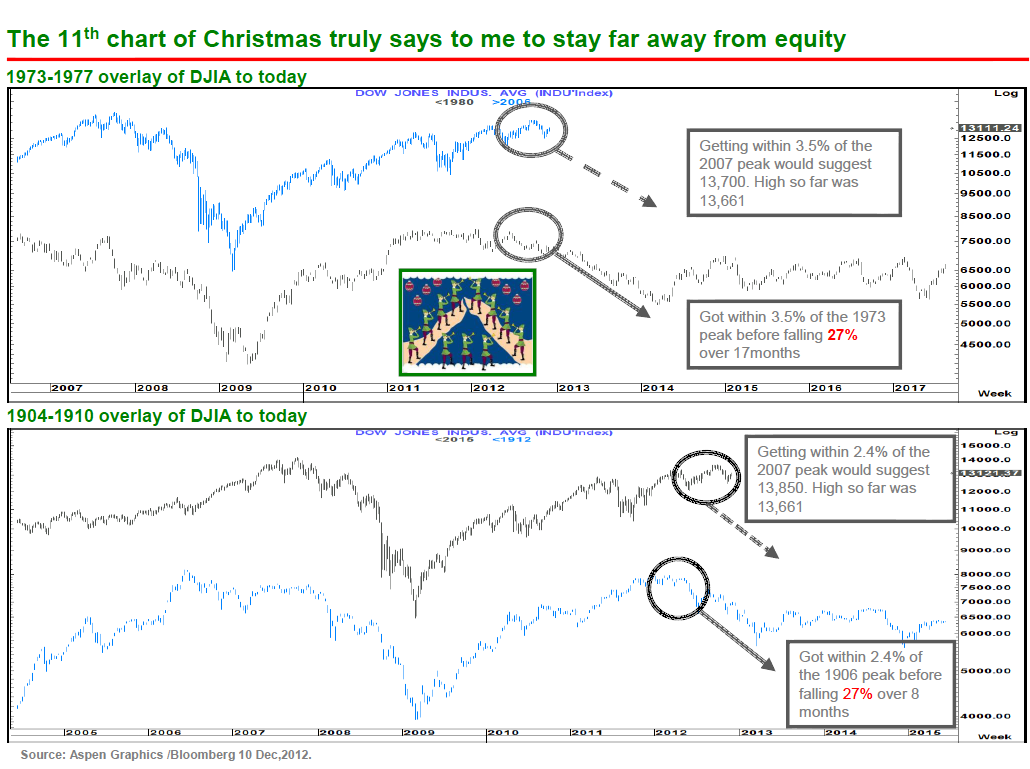
12 Charts of Christmas 2011 – CitiFX
Tags: $USDX $DX_F $BNO $SPX $SPY $GC_F $GLD
There’s a lot to talk about these days in the charting world, both long term and short term. But today I wanted to bring up one of the more interesting transitions in money flow that I see out there. In case you didn’t know, for most of the last decade, Latin American stocks consistently outperformed much of the developed world, specifically outside of North America. But I’m pretty sure this is now changing.
The MSCI EAFE Index (Europe, Australasia and Far East) is designed to measure the performance of developed markets outside of US and Canada. There are 22 counties including Australia, Germany, France, Japan, Sweden, & UK.. On the other side, we are looking at the S&P Latin American 40, which consists of 5 major Latin American Markets: Brazil, Peru, Chile, Colombia, and Mexico.
The vehicles we’re using are iShares $EFA and iShares $ILF. Here is a 10+ year weekly chart looking at what I consider to be a huge base and potential bottom:
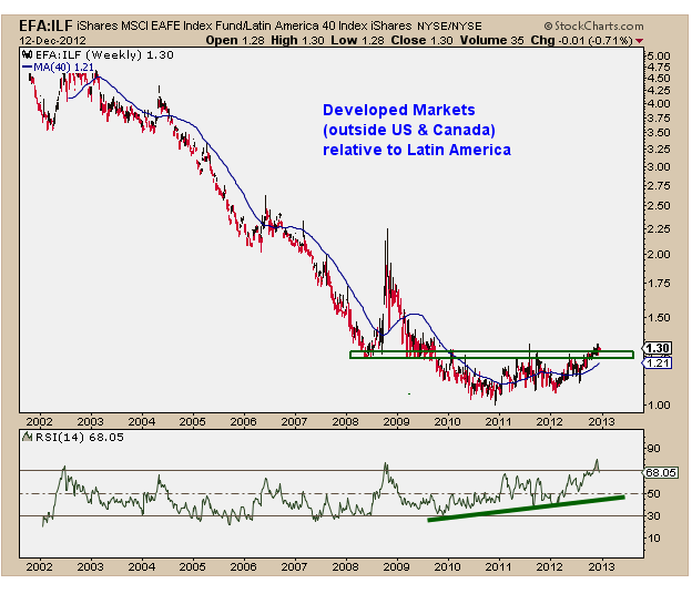
We’re seeing a 4-5 year bottoming process that is typical of what is necessary to turn such a strong trend around. Momentum turned up a long time ago, as we can see in the Relative Strength Index below. And also notice the 40-week moving average now turning higher in favor of EAFE over Latin America.
One of the reasons I find this chart so interesting is really because of the potential upside. We brought up Japan and Europe recently. And even though Mexico looks good on an absolute basis, it appears as though stocks in developed nations (outside north america) as a group seem poised to outperform going forward.
I hope you find this one as fascinating as I do
Source:
MSCI Global Equity Indexes (MSCI)
Tags: $EFA $ILF $EWW $EWG $EWF $EWJ


