Mystery Chart:
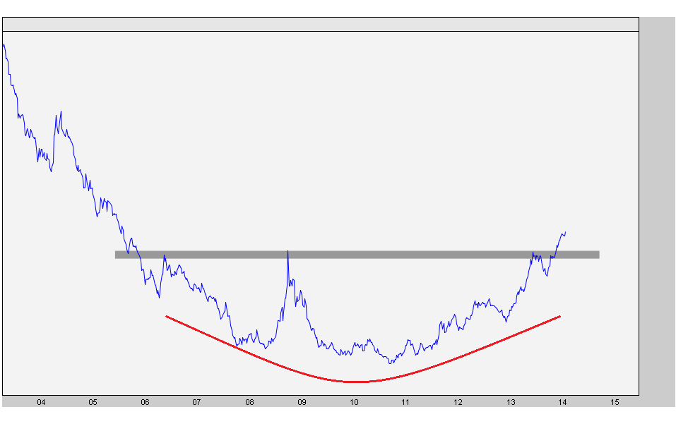
Are you a buyer? Or would you want to fight this trend and short it?
Expert technical analysis of financial markets by JC Parets
Mystery Chart:
Are you a buyer? Or would you want to fight this trend and short it?
Coming into the new year, BlackBerry was one of the names on my radar that I thought could double in 2014. After a monster January, shares of the Canadian mobile services company have been consolidating nicely below a declining 200-day moving average. I think there’s more upside here.
First let’s take a step back and look at this from a longer-term perspective. This is the chart that got me interested in $BBRY in the first place. Here is what I saw in December:
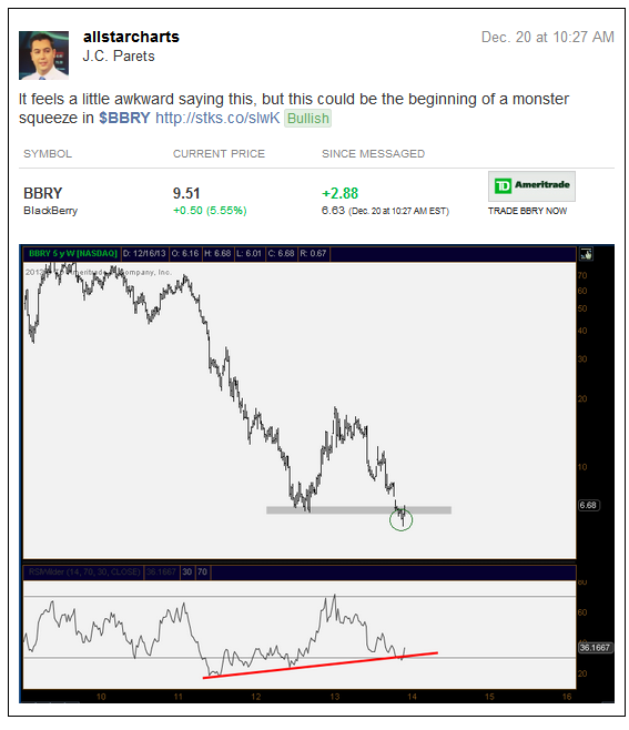
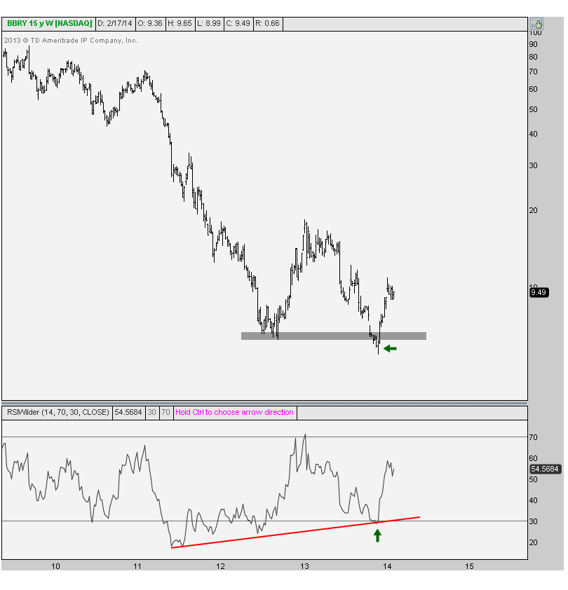
You can see why this is my favorite setup: the false breakdown and simultaneous bullish momentum divergence. Here is what this one looks like today:
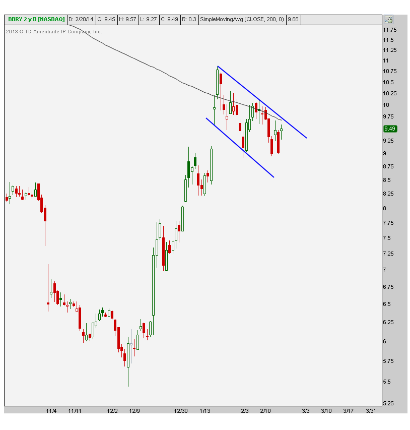
The next chart shows the daily candles for BlackBerry shares correcting in a pretty standard flagging pattern. This seems like normal, healthy action to me, and it’s taking place at a logical level. I would look for a breakout above this pattern, which would allow the moving average to flatten out, to signal for much higher prices. I would not be surprised to see $BBRY back at last January’s highs if indeed prices do breakout:
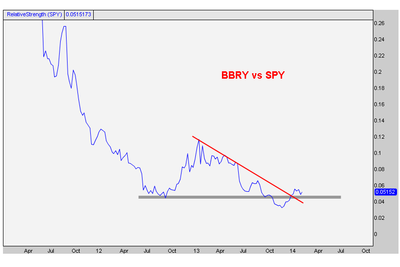
Finally here is the relative chart comparing BlackBerry to the S&P500. We can see a similar false breakdown as the weekly price chart mentioned before. I also like the BBRY/SPY chart breaking out above this downtrend line. These are all positive developments.
So what’s the catalyst? Well, we all know that this company is a disaster. But that’s the point – it’s not a secret. Shorts think their cute trying to take advantage of more downside. I mean 20% of the float is still short. How much of this train wreck is already priced in? I would say most of it if not all of it. The market isn’t stupid.
At this point, I would want to see a breakout above this potential flag pattern. We only want to own this above its 200 day. There’s a lot of upside left in this one and it could double once again. But let it prove to us that it can absorb all of this supply first.
REGISTER HERE if you’re interesting in receiving top/down analysis like this on a regular basis.
Tags: $BBRY $SPY
Over the last couple of months I’ve been pretty short-term bullish on precious metals. I’ve done my best to emphasize the “short-term” because structurally this space is still a mess. Gold specifically has been churning around these levels since its collapse in price last summer. With a declining 200 day moving average and a ton of overhead supply, it’s hard for me to be see this as structurally constructive at this point.
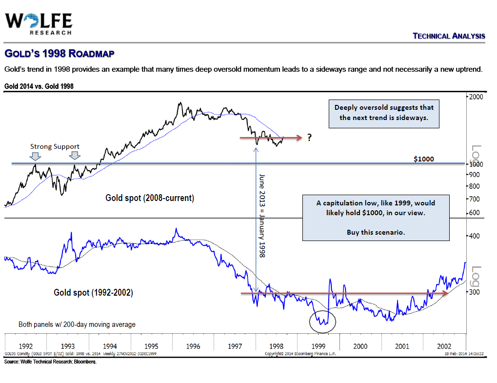
On Wednesday night, my friend Ari Wald of Wolfe Research presented in front of the New York City Chapter of the Market Technicians Association. One of the charts he brought up was the long-term chart of Gold. He compared the recent price action to what we were seeing in the late 90s. Remember, no two scenarios are ever exactly the same. But I think it’s worth discussing in order to open our minds to different road maps for the yellow metal.
Click chart to embiggen
The reason I bring this up is because longer-term I don’t have a lot of conviction in either direction. I think this bottoming out is going to be a process. I tend to lean in the direction of a secular bull market in Gold, but after such an awesome run, a cyclical consolidation is well-deserved.
You’ll notice in the chart above that in the late 90s, after the initial bottom (which Ari is comparing to last June’s lows), prices had only just started their bottoming process. It took several years to build the base necessary to send Gold prices up over 650%. This 1998-2002 bottoming process is another great example of the old saying, “the bigger the base, the higher in space”.
I can definitely see a scenario where Gold prices go back down to 1000, where we not only have that psychological level of support, but also resistance from 2008 & 2009. Last June could have very well been the bottom, I have no idea. But in all likelihood, this is probably going to be a bigger process from a secular perspective. I think Ari did a nice job at pointing out the last bottoming process to help open our eyes to different scenarios.
So let’s stay open minded….
Tags: $GC_F $GLD $SI_F $GDX $SLV
Many of the major US Stock Market sectors have already broken through their 2007/2008 highs. Healthcare, for example, is 60% above its 2007 all-time highs. Staples, Industrials and technology are all very much above those 2007 as well. Materials, however, are finally running into those highs now.
REGISTER HERE if you’re interested in receiving information about how to access all of these sector by sector charts on a weekly basis.
***
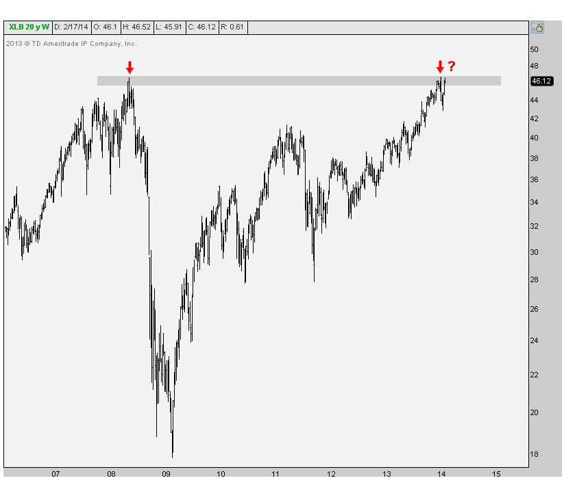
First, here is a weekly bar chart showing the SPDR Materials Sector Index Fund $XLB running into all-time highs from 2008. After a historic crash followed by a recovery that was just as historic, the market has proven there is memory here. Last time we hit these levels, prices lost 60% over the next 10 months:
The next chart takes a closer look at the daily Japanese Candlesticks running into historic supply:
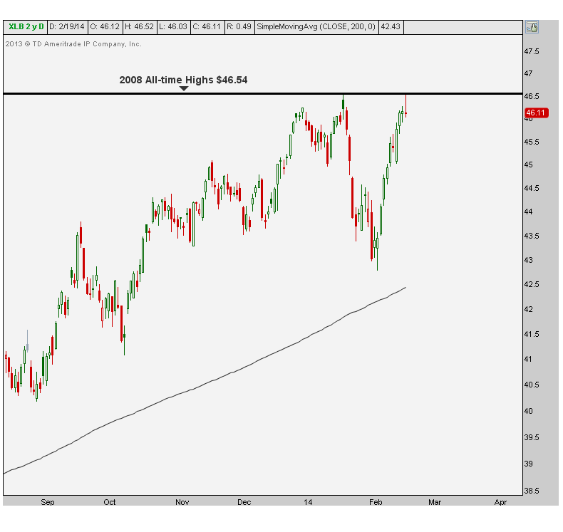
I can’t buy Materials up here with a straight face unless prices prove they can breakout and hold above this resistance. We’ve see what some of these other sectors have done upon their breakouts (healthcare is a great example), but Material prices have yet to prove they can absorb all of this overhead supply. I think it’s worth waiting for. Shorts, on the other hand, can use these levels as a stop. The risk/reward is definitely skewed in favor of the bears up here in the short-term.
The next chart shows the longer-term relative performance compared to the S&P500. 2008 support became support once again in 2012. But last year prices broke down to the lowest levels since 2006. Relatively speaking this is still a broken chart:
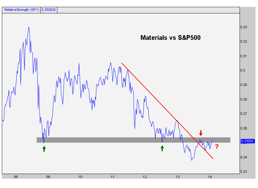
We can see that XLB/SPY has broken above this downtrend line from 2011, yet still below all of this broken support. If we start to see a breakout back above those lows, then we can make a solid argument for a relative overweight in the basic materials space.
There is a very high correlation between Materials and the S&P500. It’s a much stronger relationship than most people might think. Over the past year, we see a +0.96 positive correlation with the S&P500. Short-term the relationship is solid as well: +0.94 over the past quarter and +0.96 over the past month.
It looks to me like the reaction up here in Materials could be followed by the S&P500. Du Pont, Monsanto and Dow Chemical represent about a third of this entire ETF. So we’ll be watching closely.
***
REGISTER HERE if you’re interested in seeing this type of analysis done on the rest of the US sectors
Tags: $XLB $SPY $DOW $DD $MON
This is one that we haven’t discussed here in a while but I think it’s worth mentioning. Long time readers remember how annoying I was about the Crude Oil to Natural Gas bubble back in early 2012. A spread that has averaged 10:1 over the past 20 years went parabolic above 54:1 in the second quarter 2012.
I wrote countless blog posts about this, mentioned it on TV several times, and followed up afterwards. But the crash continues into 2014. What was once as high as 54:1 is now down to 18:1 and still falling hard putting in fresh multi-year lows this month. Here’s the beauty of the whole thing: prices are still 45% away from the historic mean. And more importantly remember that, “we are not just in a reversion to the mean business, but in a reversion beyond the mean business” (to quote Soros’ technician John Roque).
Here is the chart of the bubble popping and subsequent crash:
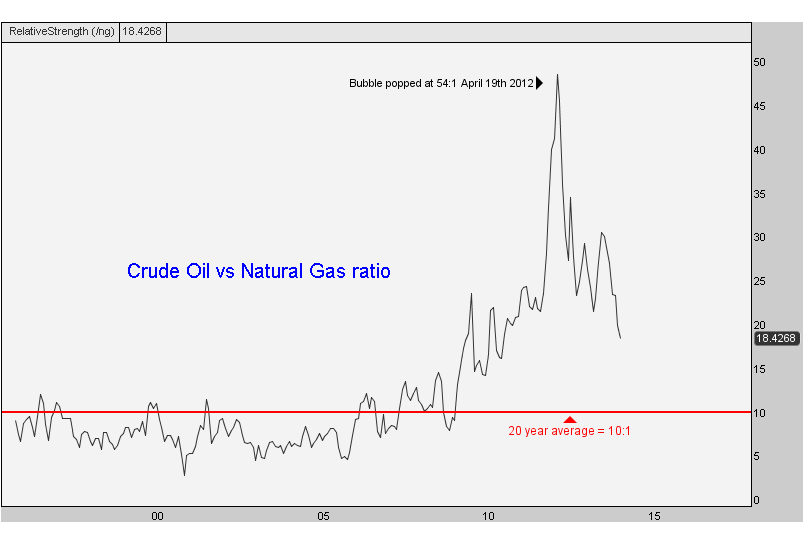
This is a monthly line chart, so it does not show the absolute highs above 54:1, just the monthly closing prices. But you get the idea. I would not be surprised to see this thing down under 8:1 – 10:1.
There is still plenty of room to go from what I can see. Rather than worrying about whether or not today looks like the 1929 stock market crash, we’d rather focus on markets that are actually crashing.
***
REGISTER HERE if you’re interested in receiving information on how to access this research on a weekly basis.
Tags: $UNG $NG_F $USO $CL_F
There is an interesting pattern taking shape in the Solar Stocks. More specifically, the Guggenheim Solar ETF $TAN is breaking out of what could be an inverse head & shoulders continuation pattern. I first brought up the possibility of this breakout on Saturday in a post showing some of the highlights from a long charting session.
This one is pretty standard: In October, the Solar exchange traded fund ran into resistance in the low 40s. After a brief correction, prices rallied right back up there in November and rolled over once again. This time TAN made lower lows into December. After one more rally and retest of this resistance, prices once again rolled over. As always, the more times that a level is tested, the higher the likelihood that it breaks. Sure enough, Tuesday morning Solar stocks broke out to new highs, finally clearing all of that supply (resistance):
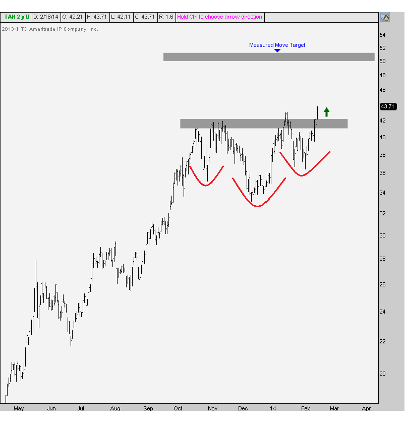
As long as prices hold this breakout, prices should be heading a lot higher. The measured move based on the size of this pattern takes us above $50. This target is based on the 9 points between the bottom of the head and neckline.
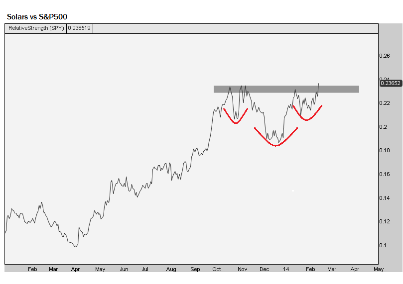
From a risk/reward standpoint, this one is definitely skewed in favor of the bulls. Not to mention, the trend is clearly up in this space – up 245% over the past 15 months. Look at the relative chart of Solars vs the S&P500 putting in a similar pattern:
This ETF seeks to mirror the performance of the MAC Global Solar Energy Index. Some of the top holdings include $SCTY $MBTN $FSLR $REC $GTAT $CSIQ $SUNE $YGE $SPWR and $TSL. Feel free to look through the Guggenheim Fund summary for more information on the Solars.
***
REGISTER HERE if you’re interested in receiving information about how to access all of these sector by sector charts on a weekly basis.
Here is the video of our panel at the New York Traders Expo

Source:
Over the weekend I was going through all of my favorite charts, making annotations and writing down notes. One of the things I like to do to get a good feel for the US stock market is to rip through all of the S&P sectors and sub-sectors on multiple time frames to get a good read on money flow. Which ones are the strong sectors? Which ones are the weak sectors? Are any of these actionable? What does the sector rotation tell us about the overall stock market and/or interest rates? These are all question that I ask myself along the way.
REGISTER HERE if you’re interested in receiving information about how to access all of these sector by sector charts on a weekly basis.
***
Today I want to focus on the strength that we’re seeing in Utilities and REITs, both on an absolute and relative basis. These guys are known around The Street as income generators, as they pay some of the highest dividend yields of any stock market sector out there.
As it turns out, with the S&P500 down half a percent so far this year, Utilities and REITs are each up over 6%. That’s quite a difference. Now, is it a coincidence that these guys pay the highest dividends and are outperforming by this much so far this year? I doubt it. I don’t believe in coincidences when it comes to Mr. Market.
First, here is a chart of the $XLU – SPDR Utilities Select Index. We’re looking at daily bars putting in a nice symmetrical triangle well-defined by these two converging trendlines. Notice the false breakdown in late-December and early-January that became the catalyst to break this one out to the upside. I love it when that happens:
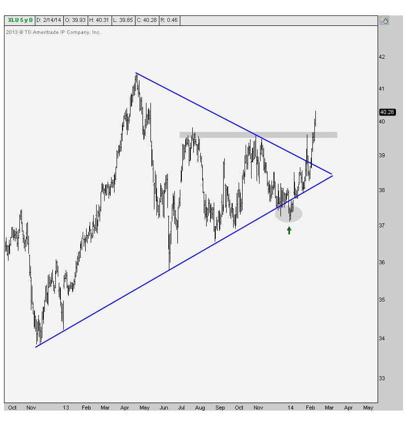
It looks to me like prices are heading up towards last year’s highs, especially if they can hold above the July & November resistance (shaded here).
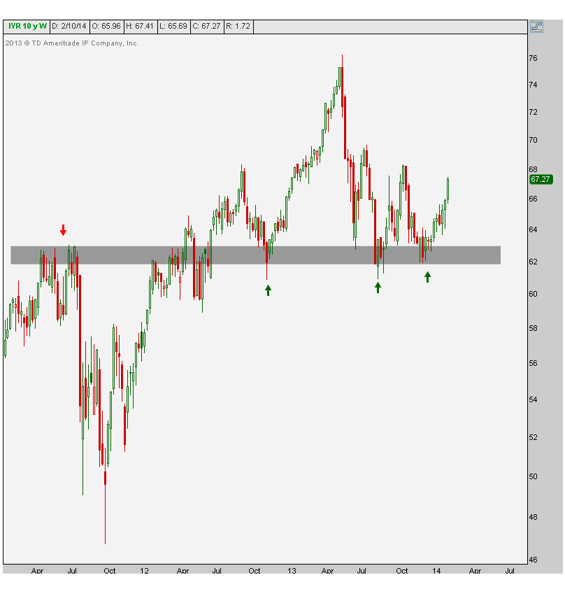
The next chart shows the weekly candlesticks for the iShares US Real Estate ETF $IYR, to get some context. You can see that what was once clear resistance throughout 2011, eventually became support in 2012 and 2013. And now prices are ripping.
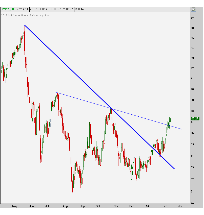
Here’s a closer look at the recent action in REITs. We can see clean breakouts above both downtrend lines from last year. A thing of beauty no?
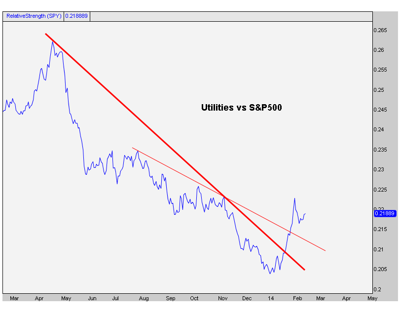
Now more importantly look at the relative strength charts for Utilities and REITs. These represent each sector compared to the S&P500. The first one shows Utilities breaking downtrend lines across the board:
And the next one shows REITs doing the exact same thing:
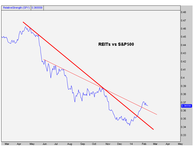
So why do we think there is so much strength, relative and otherwise, into these dividend paying sectors? Could it possibly be that it’s because money managers are looking for places to get yield? Why would they need to do that? Why would they increase their risk for just a little bit more yield when they can get a guaranteed return from the Government not too far from what these guys pay? Could it be that it’s because they think rates are going lower?
You guys know how I feel. I’ve been calling for lower rates for two months. We’re now started to see the stock market react to what I think we’re seeing. Are the big fund managers also now positioning themselves for a lower rate environment?
I’m just presenting the facts. You guys draw your own conclusions. You know how I feel. But what do you think?
REGISTER HERE if you’re interested in gaining access to these as well as the rest of the S&P sector charts on a weekly basis.
Tags: $IYR $XLU $SPY $TLT $TNX


