Q1 in the books. That was quick.
Here’s a short video I did after the close Friday with Dr. Phil.
We went over US Stocks, specifically the defensive leadership, weakness in Vietnam and Lululemon:
Tags: $XLV $XLU $XLP $LULU $SPY $MDY $VNM $IWM $DJI
Expert technical analysis of financial markets by JC Parets
Q1 in the books. That was quick.
Here’s a short video I did after the close Friday with Dr. Phil.
We went over US Stocks, specifically the defensive leadership, weakness in Vietnam and Lululemon:
Tags: $XLV $XLU $XLP $LULU $SPY $MDY $VNM $IWM $DJI
Here we are at the end of the first quarter. So now is probably as good a time as any to take a look at sector performance for the year. And it’s the defensive names that have been the clear leaders so far. We first brought this up a month ago, and the rotation into more defensive sectors continues. Coming into March, the leaders for the year had been Consumer Staples and Healthcare. Now with the Healthcare space leading the way once again this month, the year-to-date sector performance story remains pretty much the same: Defensive: Healthcare and Consumer Staples are the clear winners, while Tech and Materials lag big time. Here are the YTD numbers relative to S&Ps:
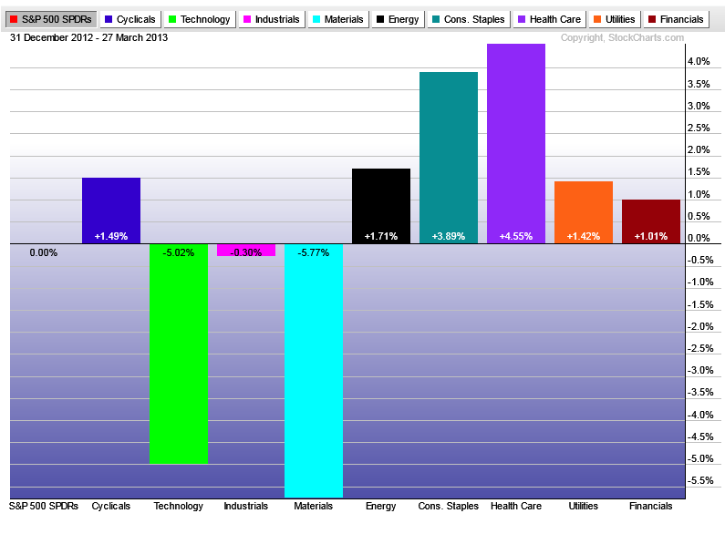
For the most part, this action is nothing new. Industrials struggled a bit more than usual this month, while Consumer Discretionaries caught a little bit of a bid. But other than that, the leaders for the last month really stand out: Staples, Healthcare, Utilities:
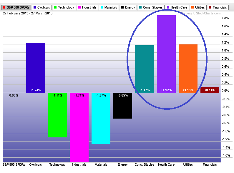
This rotation into defense and out of the more aggressive leaders that took us to historic highs last year is one of the reasons I’ve been extra cautious with US Equities lately. We’ve seen some bearish divergences in momentum, major selling and even bear markets in Europe and Emerging markets. But the daily charts for US Stocks remain intact. And sure, defensive sectors can keep leading this market higher. But if I’ve learned anything throughout my career, it’s that towards the end of the run, these defensive guys tend to lead. So this isn’t surprising.
Look at the daily chart of S&Ps. They still look fine for now. But if they start to break, that’s a different story.
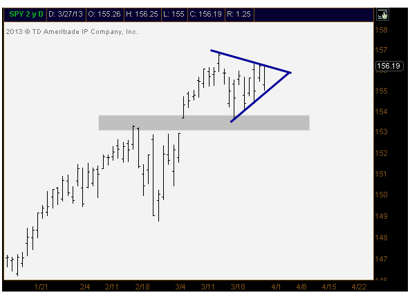
Like I mentioned last week, the 153s are still my level to watch in $SPY. As long as we’re above, I believe things are still fine in the US. But watch your back.
Tags: $XLB $XLP $XLU $XLB $XLY $XLK $SPY $SPX
*In case you missed the webcast, I’ll publish the video as soon as it’s made available
***
I’m pumped up for this afternoon. I hope most of you can join us.
The Market Technicians Association has asked me to host a webcast today as part of their ongoing Educational Web Series. Some of my favorite technicians on earth have been asked to do the same over the years, so it really is a huge honor for me to be invited. I promise to try to make it as awesome as possible.

We’re going to break it down into two parts. I want to really focus on momentum and price divergences. Readers of the blog know how much I like using the relative strength index (RSI), so I’ll explain how I incorporate it with my intermarket work, sentiment and sector rotation. I’ll then touch on how technical analysis is being done and shared throughout the social media world and how it’s helped me over the years. We’ll also leave some time at the end for Q&A.
We’re going to get going at 4:30 eastern. Use this link to to enter the webcast and try to be there 10-15 prior to start time. Everyone is welcome to attend at NO COST.
Looking forward to it!
One of my most important charts has to be the relative performance chart for Consumer Staples. I don’t care if you’re a technician or not, this is a big one. The psychology behind the price action is very simple: Money has to be put to work, one way or another. Whether that money goes into Tech, Financials, Discretionaries, or chooses to be more defensive into Staples is another thing. If the economy is slowing and things are “bad”, we’re still going to drink soda, smoke cigarettes, brush our teeth and wash our dishes right? That’s not going to change. So when institutions need to allocate money and prefer to be “defensive”, for whatever reason, the flow into staples picks up relative to other areas of the market (Coca-Cola, Philip Morris, Colgate-Palmolive, etc).
Here is a daily line chart of S&P Consumer Staples vs S&P500 to show the relative performance I’m talking about. I think it’s pretty clear that since the 2008 market crash, when institutions were dumping money into staples on a relative basis, price has been coiling to the point where it’s decision time very soon:
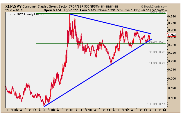
The XLP/SPY correction off the 2008 highs retraced approximately 61.8% of the entire crash move. This is pretty standard within an ongoing uptrend. Also, the combination of the downtrend line off the 08 highs and uptrend off the 07 lows has created this symmetrical triangle looking formation that needs to resolve soon.
A breakout from this pattern would be bearish for US Stock as a group, in my opinion. While a breakdown here, which I consider much less likely, would bode well for equities as an asset class.
I’d be watching this one closely if you have any exposure to the stock market whatsoever.
Related Posts:
Are Staples The Key To This Market? (March 6, 2013)
The First Two Months of 2013 (February 28, 2013)
Tags: $XLP $SPY $CL $PM $KO
The Market Technicians Association has asked me to host a Webcast as part of their ongoing Educational Web Series. In the past, the MTA has invited brilliant technicians such as Martin Pring, Charles Kirkpatrick, Ralph Acampora, and others that I’ve looked up to throughout my career. So to be the next one in this group truly is an honor for me.
The topic will be Momentum Divergences & Social Media in Technical Analysis. As always, the webcast will be Free for all who attend and will run approximately 1 hour. This will include about 10-15 minutes for Q&A at the end.
The Presentation will begin at 4:30 PM Eastern Wednesday March 27, 2013
Please use this link on Wednesday to log in and shoot to be in the webinar 10 minutes prior to start time.
See you there!
JC
Phil and I had a nice little chat on google hangout this afternoon.
We discussed Europe, Yen, US Stocks and Apple:
Check it out:
Related Posts Mentioned:
Where Do We Panic? (March 21, 2013)
What Do We Do With Apple? (March 15, 2013)
Is Apple Stock About To Crash? (September 10, 2012)
Tags: $EURUSD $FXE $USDJPY $AAPL $FXY
Alright let’s keep it real. I’ve been cautious on US Equities since late February and they’ve relentlessly kept rocking to all-time highs without caring what I think. The monster breakdowns in Copper, Emerging Markets and Europe with the continued bid in Treasuries and US Dollars and a simultaneous rotation into defensive stock sectors have kept me from being leveraged long US Equities. It has not been fun.
So sure anything we short in Europe or emerging markets has worked great. Some non-correlated stuff has worked and some hasn’t. Fine. But we haven’t been seriously short US Stocks because price hasn’t given us a reason to. Occasionally we’ve taken a stab on some things but nothing that could have a big impact on the bottom line. The conviction on the long side just hasn’t been there, and price hasn’t said short the hell out of everything. When you’re not sure, get smaller right? But now the question becomes, where does price say to short everything?
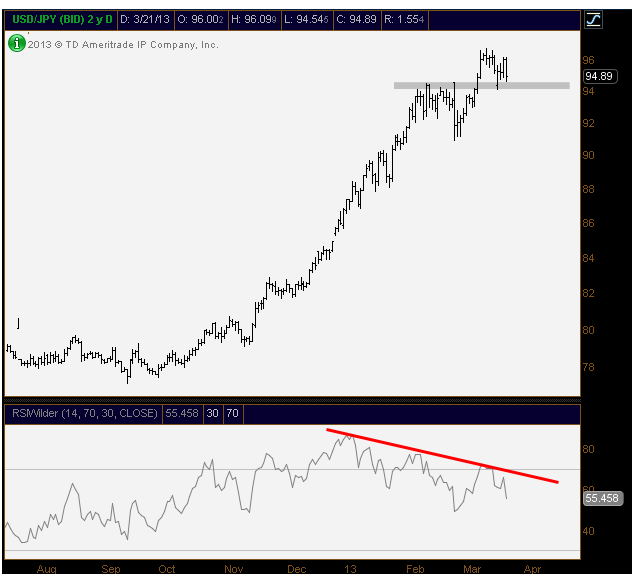
To me there are 2 important charts that I am following very closely. The Yen and S&Ps. And they both look exactly the same. We broke out to new highs at the beginning of March, bearish divergences in momentum continue to develop and now those new highs need to hold. Or else.
Here is $USDJPY with the 94s as my big level:
Here is $SPY with the 153s as my big level:
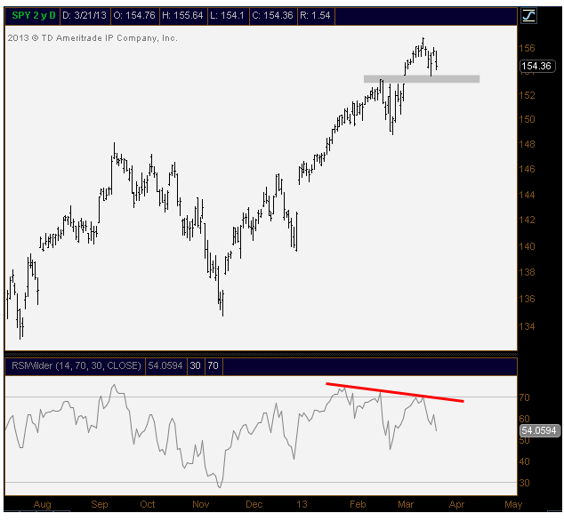
In my eyes, those are the lines in the sand. As I pointed to here, the Yen has the highest negative correlation to US Stocks out there right now. They should both do the same thing. I think future shorts can be initiated as long as we’re below the above mentioned levels. If we hold (which I’m not counting on), then the market is still fine.
These are serious lines in the sand that we cannot and will not ignore. I’ll do my best to write a follow up post if and when they break. At that point we’ll see if anything has changed and we can also discuss some potential support levels. But that’s a conversation for another day. Watch these levels guys…
Related Posts:
Thoughts On Risk (March 8, 2013)
European Underperformance Continues (March 5, 2013)
Tags: $SPY $SPX $ES_F $FXY $USDJPY
Here is something that I’ve found myself getting into friendly arguments about lately. When money is scared and wants to come out of risk assets, what is the safest place? Where do they go? The easy answers are obviously the US Dollar and US Government bonds right? Some people might say gold. But the math says otherwise. If you look at just the numbers, the winner is by far, the Japanese Yen.
And I don’t know why that is the case. I get asked, “why”, all the time. Not really to worried about the answer. We’ll let the math do the work and answer the more important question of, “what?”.
So when you look at negative correlations with US Equities, the US Dollar Index is actually a plus 0.58 for the month and plus 0.68 for the quarter. Sure it’s at -0.52 for the year, but no where near as high as what you might expect the safest haven to be. Treasury bonds show a nice negative correlation, but again, surprisingly low coming in at just -0.74 for the month. While -0.91 for the quarter is nice and high, the -0.55 correlation with S&Ps for the year doesn’t convince me. Gold has a zero correlation for the month, -0.68 for the quarter, and actually a positive 0.24 for the year. So gold isn’t the answer either.
Which brings me to the Japanese Yen. The clear winner here having a correlation with the S&P500 of -0.93 for the past month. The -0.96 for the quarter and -0.77 for the year makes the Japanese Yen, the highest negatively correlated asset on earth. So does that make it the safest haven?
Think back to 2008 when all hell was breaking loose. Did money flow into gold? Nope, they sold them too. Sold them hard. The “quality” that was being flown towards was the US Dollar, Treasuries, and Yen.
Here’s something else. Sunday night when fear was building and top callers were organizing bear parades, where did money flow right away? What was the initial gut reaction? US Dollar Index was up 0.69% at the futures open. Gold shot up 0.94%. US Treasury Bonds were up 0.73%. But the Yen? EUR/JPY was down 2.3% Sunday night at the open. Euro was obviously where money was feeling from. So where was it fleeing towards? EURUSD was only down 1.17%. So it wasn’t the US Dollar right? It was Yen. In fact, Sunday night at the open, USD/JPY was down a percent.
So this is my math. Am I missing something? The most negatively correlated asset class with US Stocks in the world is the Japanese Yen. When money gets scared, where does it flow to the fastest? Seems like Yen. So as Yen goes, the opposite should be in store for US Equities no?
Just my thoughts. I’d love to hear your comments. And no I don’t want to have a philosophical conversation about fiat currencies, or central banks in Japan. Lets try to keep this about price and intermarket relationships.
Oh yea, one more thing. Keeping in mind the very high negative correlations with US Equities and Yen, here is the recent commitment of traders report from Sentiment Trader showing the Commercials loading up, while speculators are historically short Yen.
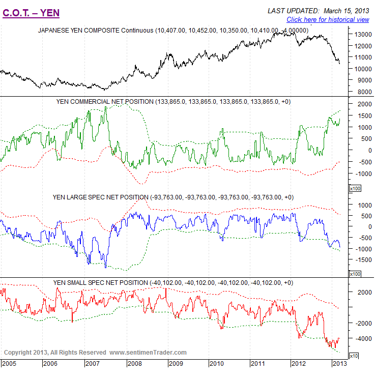
Thoughts?
Source:
Committment of Traders Report – Yen (SentimentTrader)
Tags: $EURUSD $USDJPY FXY $EUR/JPY $GC_F $GLD $TLT $ZB_F $UUP $DX_F


