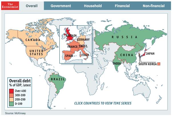
I came across this interactive chart in the Economist today. Click on the individual countries for the details:
Source:
Expert technical analysis of financial markets by JC Parets
I came across this interactive chart in the Economist today. Click on the individual countries for the details:
Source:
Sentiment – Financial Advisors are Largely Bullish (PragCap)
Technicals Trump the Tape in Financials (SMB)
Analog Analysis Points S&Ps to 1500 (PeterLBrandt)
China vs the Fed: Who Owns More of Uncle Sam’s Debt (WSJ)
Short Interest on NYSE at a 9-Month Low (Bloomberg)
Ron Roll: $SPX Read Going Forward (gtotoy)
Clean Breakout in $LEN Lennar (SlopeOfHope)
Massive Multi-year Breakout for Biotechs (ReformedBroker)
Nifty Might Consolidate Before Moving Up (EconomicTimes)
Gold vs Debt Ceiling: What is the Correlation (Ritholtz)
Relative Strength of Small vs Large Cap Stocks (Bespoke)
Mary Ann Bartels on Volume: Lack of Participation is Hurdle to Bigger Breakout (MarketWatch)
Value Breakout or Growth Breakout (DynamicHedge)
Population Living In Urban Areas By Country + Forecast (Economist)
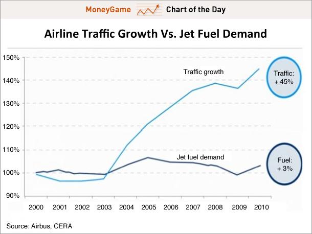
Efficiency Growth: Airline Traffic Growth Vs Jet Fuel Demand (BusinessInsider)
Tags: $CHINA $SPX $SPY $ES_F $XLF $RUT $IWM $DJIA $GLD $GC_F $INDY $CNXN $IBB
I’ve been getting a lot of emails and phone calls about this head and shoulders pattern developing in the British Pound Sterling vs US Dollar ($GBPUSD). I say developing, because nothing has been confirmed. To the contrary, the new low put in last week couldn’t last for more than an hour.
The cool kids in the forex world call this cross the Cable because back in the 1800s this particular exchange rate was transmitted from London to New York via transatlantic cable. But the gossip these days is all about the head and shoulders pattern that’s been setting up since summer of 2010. As you can see in this weekly chart, higher highs were made in November of 2010 and April of 2011 with corrections finding support down in the 1.53’s. These two highs are the left shoulder and head for the potential pattern. The right shoulder was put in when $GBPUSD made a lower high 3 months ago.
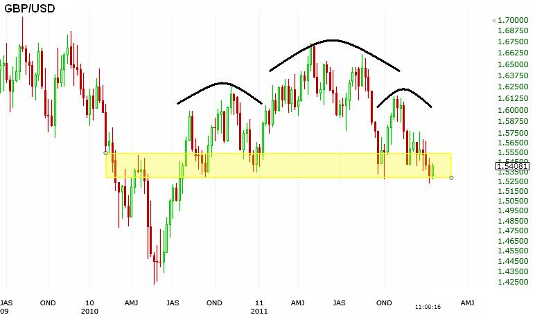
I think the neckline in the 153’s is really the key. A convincing break below this level would give us a target of 139 for cable. (Head 167 minus Neckline 153 = 14 & 153-14=139). But I get the feeling that this one is just way too obvious. If the break last week was a fake out, then we could see new highs in the cable above 167 fairly quickly.
RSI is showing bullish divergences here in $GBPUSD as well as in the equivalent exchange traded fund $FXB. Look at the new lows made in price as higher lows are being established in the oscillator.
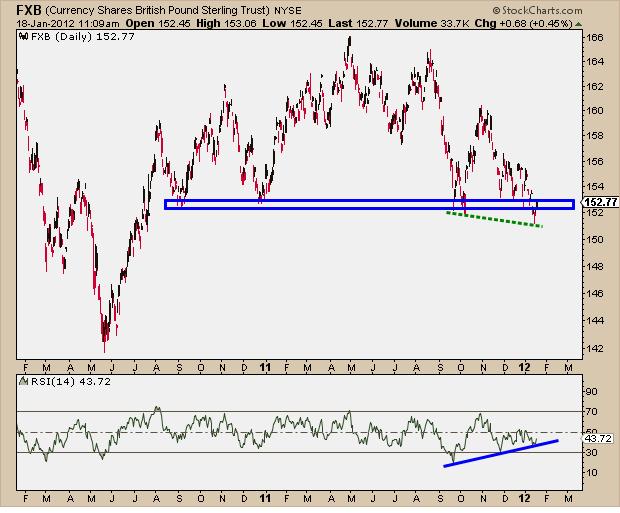
If Cable makes new lows, then you can use the measured move based on the math above. But if last week’s lows hang on, then you’ll probably see a nice little squeeze higher.
Also See:
I look at just one oscillator to supplement my price analysis – and that is the Relative Strength Index (or RSI). I say supplement because it’s only price that pays us, so anything else is secondary. Now with that said, one of the most simple, yet extremely useful observations you can make in RSI is to see what kind of mode the underlying asset is currently in: Bearish or Bullish.
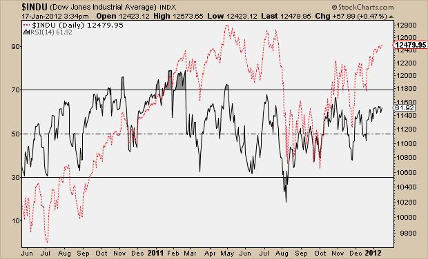
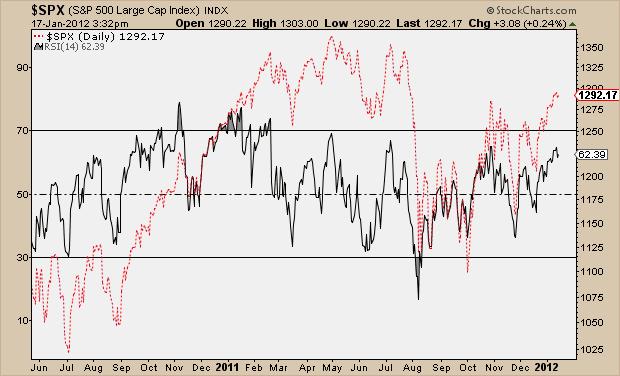
As I explained in this post, when the (14-period) RSI is in bullish mode the oscillator tends to move into overbought territory (above 70) during rallies, while never getting oversold (below 30) as it naturally corrects. The inverse is also true when assets are in bearish mode – the range gets down into oversold territory while never getting overbought during counter-trend rallies. So in other words, overbought readings are a good thing – it’s evidence of buying. It tells us that there is an extreme amount of buyers present for that particular asset, whether it be a stock or Index.
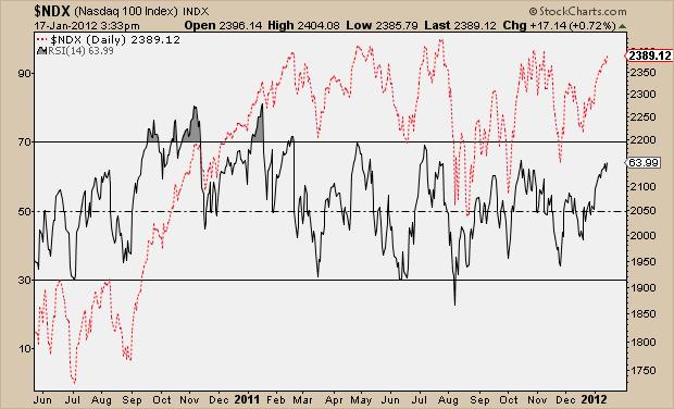
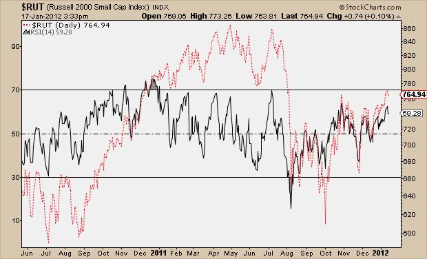
Right now none of the major US equity averages have reached overbought levels on their daily charts. Since the price lows in August (where RSI showed extreme oversold readings), the market has yet to get above 70. In fact, most of the indexes still haven’t seen anything above 65 in RSI, which is typical of an asset in bearish mode. Here are the Indexes one by one where you can see the oscillator (in black) behind the price action (in red):
Dow Jones Industrial Average:
S&P500
Nasdaq100
Russell2000
NYSE Composite
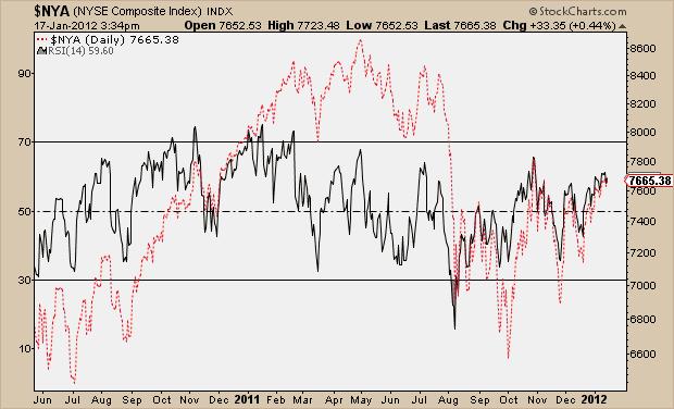
The bottom line is that US Stock Indexes are in “no-man’s land”, as far as the Relative Strength Index is concerned. Sure price action looks great as we make new highs. But to have some serious bullish conviction going forward, you really want to see some overbought readings in RSI. You definitely don’t want to see any oversold readings, otherwise that would confirm the bearish mode that we’ve been in since late summer. But in this oscillator, at least, overbought readings would be a good thing and should be considered a blessing.
Tags: $SPX $SPY $DJIA $NDX $NYA $QQQ $RUT $IWM
“To ignore these interrelationships is really to deprive yourself of tremendously important information. What happens in one market tells you a lot about what’s happening in another market…….the old days of using a single market approach is really obsolete. All of these global markets are linked” – John Murphy
Source:
John Murphy Explains Intermarket Analysis (Market Technologies)
Do you know anyone that thinks the Euro is going higher against the Dollar?
Seriously. I can’t think of one.
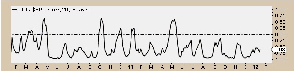
The gossip around my neck of the woods is all about the end of the US Stocks and Euro’s positive correlation. Stocks are making new highs and the Euro is making new lows. Is this new negative correlation here to stay? Maybe. But remember that fluctuations in correlations are nothing new. Correlations have ups and downs just like asset prices. Look at the volatility in the correlation coefficient between the S&P500 and the Euro over the last couple of years. Is the action we’ve seen lately anything that we haven’t seen before?
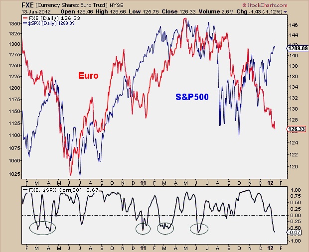
The higher the Correlation Coefficient is above zero, the stronger the positive correlation. When it’s below zero, the two assets become negatively correlated and would typically trade in opposite directions on any given day. The negative correlation between the S&P500 and US Treasury Bonds is much more consistent. But as you can see in this chart, there is still some volatility there too.
From Barrons:
THE CROWD HATES THE EURO. Why not, right? If you were a crowd, wouldn’t you find something to dislike about a structurally flawed currency like that, whose member states are having their credit limits trimmed?
Still, at certain points in time, even a crowd acting on a solid rationale gets penalized by the markets for an excess of conviction. Jeff deGraaf of Renaissance Macro Research points out that “sentiment on the euro has turned downright ugly,” with the percentage of bulls in the Consensus Inc. polls near 15%, around the lows last seen in late 2008. The flip side is the abundance of bullishness on the dollar, evident in the exposure to long dollar positions tracked by www.CarpenterAnalytix.com, which last week was higher than 96% of all weeks in the past five years.
In deGraaf’s view, one under-explored possibility is that fracturing of the euro zone results in some peripheral members leaving, and that “starts to turn the euro more into the Deutschemark, and proves more bullish than bearish” for the currency. This is educated conjecture right now, but deGraaf is correct in saying “this could be a big surprise for 2012.”
Jeff deGraaf is a Chartered Market Technician and founder of Renaissance Macro Research, LLC. He has been ranked by Institutional Investor magazine for the last 10 years, and ranked as the #1 technical analyst over the last six years.
Source:
Beer Makers Debt Wish (Barron’s)
Tags: $TLT $FXE $EURUSD $SPY $SPX $ES_F
Is it finally upon us?
We’ve only been waiting since last February.
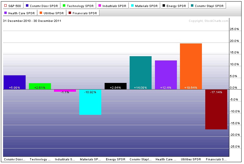
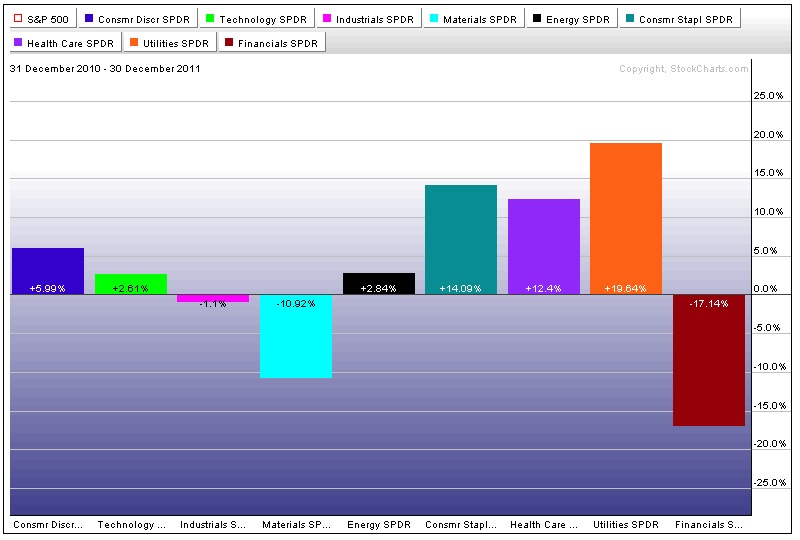
But just two weeks into the new year and the market is starting to look much different. Last year we saw leadership out of the defensive sectors like Healthcare, Utilities, and Consumer Staples, which helps to explain the inability for US Stock Indexes to make new highs in the second half of the year. The S&P500 closed flat for 2011 and 9% off the Spring highs. This year, however, we’ve seen leadership out of Materials, Financials, and Industrials. (When was the last time you read ‘Financials’ and ‘leadership’ in the same sentence?)
Look at last year’s performances by sectors – dominated by defensive names. It really stands out on this chart:
and now look at the first two weeks of this year:
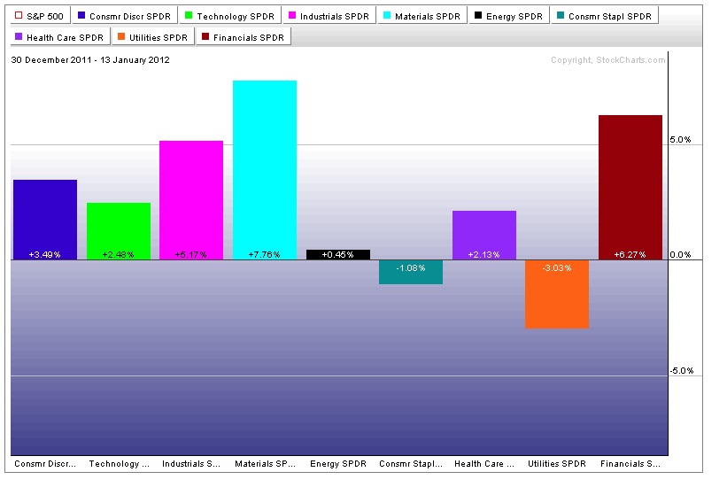
Much different story right? When market participants have an appetite for risk, money is going to flow into these offensive sectors at a much faster rate than the defensive sectors. It’s only been two weeks, which means we have 50 more to go and the data could certainly change. But if this market is going higher, like I think it will, then we want to see further outperformance from this year’s leaders.
S&P thinks they’re slick downgrading countries on Friday afternoon before a long weekend. They’re the worst.
Anyway, it will be interesting to see how much of that was already priced into this market. The price action in equities this week suggests that most of it probably was. Especially with the strength throughout the day Friday as rumors of the downgrades were already circulating.
Long time before Tuesday at 9:30. Enjoy your long weekend!
Tags: $XLF $XLE $XLY $XLI $XLB $XLU $XLV $XLK $XLP $SPY
I did a short Q&A this week with Drew Voros, Managing Editor at Hard Assets Investor. We talked about false moves and what I look for to initiate low risk trades in trending assets. It was fun. Check it out:

HAI: You’ve written recently about false price breakdowns in gold and how that can lead to fast moves in the opposite direction, as you like to say. How do you identify them?
Parets: The first and most important thing is to find a trend. One of the reasons that 2011 was difficult for stock traders was the lack of trends. We were down some, we were up some. But we were just in a sideways market. That makes it real difficult. But there were trends in other asset classes like gold. It’s been in a long-term bull market since the turn of the century, not just on an absolute basis, but on a relative basis as well, which I think is even more important, relative to stocks.
Back in 1980, the ratio of the Dow Jones industrial average to gold was 1-to-1. Over the next 20 years, that ratio went from 1-to-1, to 42-to-1. In other words, in 1980, one share of the Dow bought you one ounce of gold. In 2000, one share of the Dow bought you 42 ounces of gold. That’s the bubble that popped at the turn of the century. You don’t hear a lot of people talking about it. Ever since then, that stocks-vs.-gold ratio has been declining; 20-to-1, 10-to-1. Earlier this year we got below 6-to-1. Right now, if I’m doing the math correctly, the ratio is probably somewhere around 7- or 7.5-to-1.
But that trend is still down. Historically, gold doesn’t make top until that ratio is somewhere between 1–to-1 or 2-to-1. We still have a long way to go. We know the trend is there, not just on an absolute basis. We know gold is making higher highs, but on a relative basis, compared to stocks as well. Where do you get involved?
Let’s use gold as an example. Stocks can temporarily make new lows and quickly recover. A lot of times that might happen in a slow week. And, in this case with gold, that’s exactly what happened in between Christmas and New Year’s Day. Gold made new lows. And, sure enough, it quickly recovered and came back. Thursday [Dec. 29] was a key reversal day. It followed through a little bit on a slow Friday [Dec. 30]. And then, sure enough, we come back to work on Tuesday morning [Jan. 3], and we are a gap higher in gold.
Read the whole thing at Hard Assets Investor
Tags: $GLD $GC_F $DJIA