This is the video recording of our July 6, 2021 Monthly Charts Live Strategy Session
New Lows Remain Nonexistent
From the desk of Steve Strazza @Sstrazza and Grant Hawkridge @granthawkridge
As markets remain mixed we continue to see lackluster action from some US indexes even as some others make new highs.
Large-Caps recently charged back to fresh all-time highs, but the Small- and Mid-caps are still facing some serious overhead supply.
As always, we’re snooping around our market internals chartbook to see what’s really happening underneath the surface in these areas, and whether internals agree with the price action in these smaller market-cap indexes. And even more importantly, if they support, or disagree with the new highs in Large-Caps.
We’ll also answer the question: “Just how bad is the recent deterioration in breadth in some of the weaker indexes?”
We have been getting fewer new highs for a while now, but after such extreme initiation thrusts this isn’t too unordinary, and nothing to cause huge concern.
Although, considering the lack of new highs and messy market environment, we are on the lookout for a change in character in internals that would be a cautionary development… And this would come in the form of an expansion in new lows.
So let’s check in on our percentage of new lows indicators across short and intermediate timeframes, in order to see whether or not participation is expanding to the downside. [Read more…]
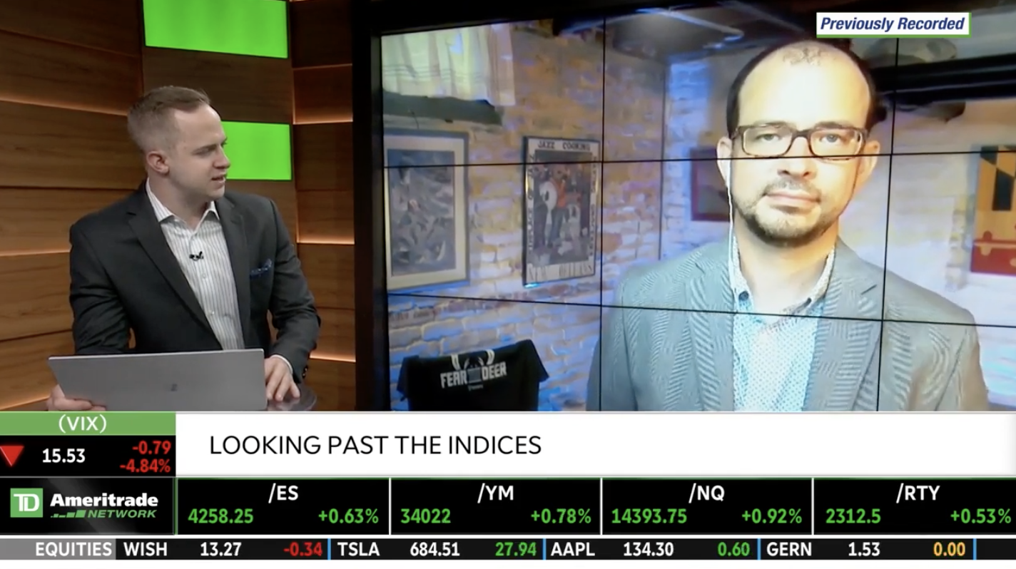
TD Ameritrade Network Appearance
From the desk of Willie Delwiche.
[Premium India] Monthly Conference Call Video Recording June 2021
This is the recording from the live June 2021 Conference Call for Members of the Allstarcharts India! Before getting into individual stock ideas in India, we’re going to first start with the global macro perspective. Once we identify the direction of the underlying trends from a structural and broader view, then we’ll dive into the NIFTY Indexes on both longer-term and short-term timeframe. We want to look at Large-caps, Small-caps and everything in between before getting into the Sector and Industries themselves like Energy, Banks and Pharma.
This is when we finally break things down to the individual stock scenario with identified risk vs reward opportunities. That is what this is all about – aligning ourselves in the direction of the underlying trend while at the same time identifying where the risk is to make sure the potential reward is skewed exponentially in our favor. You will find that throughout this process we discuss Momentum, Fibonacci and Relative Strength. I encourage you to check out the Education Section so you know exactly where I’m coming from when you hear me mention these tools.
Here is the video in full:
Small Cap Breadth Running out of Breath?
One of the most telling and obvious risk-on indicators would be the Nifty Small Cap 100 index. Why is that so?
Because when you look at a market rally, the longevity of that particular rally can be gauged by market participation. This is something that should be viewed closely. If a particular index is making new highs, how many stocks are contributing to that move?
Is it a handful? Is it a majority of the stocks? These are data points that will hint at the inherent sentiment of the move.
So let’s take a look at what the Small Cap-100 new highs are telling us. [Read more…]
Putting The Recent Surge In New Highs Into Context
From the desk of Steven Strazza @Sstrazza and Grant Hawkridge @granthawkridge
We’ve pounded the table about historic breadth thrusts since we first saw these readings start to pop up in early June of last year.
It’s now a year later, and we’re still seeing them… In fact, the S&P 500 recently registered its highest percentage of new 52-week highs in history – absolutely crushing the historic reading we saw in Q4 of last year.
So, why is this important?
These extreme readings are as bullish as it gets and are a very common characteristic of the early innings of a fresh bull market. It’s as simple as that, right?
Well, yes… But, not exactly…
While these extreme readings in our breadth indicators are undeniably bullish looking out over any period of more than a few weeks/months, over the very near-term these same bullish developments are actually cautionary signals and are often evidence of exhaustion and tend to be followed with some corrective action.
But what happens when our original November 2020 breadth thrust of 28% is eclipsed by an extra 16% about 6 months later?
Such extreme surges are incredibly rare… Let’s have a deeper look at what this could mean for investors over both long and short timeframes.
Do These Divergences Matter?
For me, it’s not just about one indicator or one chart.
It’s a weight of the evidence game.
Since March, the bet has been Messy For Longer. We’ve expected a choppy environment. That’s what the weight-of-the-evidence and history suggested.
But now what? Are these consolidations going to resolve lower? Or Higher? Or just stay messy for even longer?
That’s what makes this all so great. I don’t know. And neither do you. No one does.
It’s a beautiful thing.
So as I weigh the evidence to decide rollover or breakout, I come to a series of divergences that put this stock market in quite the predicament.
With S&Ps and major indexes hovering near all-time highs, we’re just not seeing it from the components themselves. Here’s the Russell3000, for instance, seeing fewer and fewer new highs: [Read more…]
Breadth Indicators Picking Up Bullish Signals
The process of our analysis is such that we look at a variety of charts in order to arrive at a view at any given point in time. To make sure we’re identifying new trends that are developing in the market, we have several breadth indicators that we track.
As we already know, the market has been in a bit of a mess off-late. Within this market move, different sectors have taken leadership- almost as if playing a game of musical chairs.
Over the weekend when I was going through the usual suspects (charts) I noticed a slight change in market activity. So here I am talking about it!
- « Previous Page
- 1
- …
- 17
- 18
- 19
- 20
- 21
- …
- 35
- Next Page »


