At this point, you have enough background to fully understand the dynamics behind what we do as Technicians as well as how to interpret what is printed on a chart. This set of lessons focuses on the principles behind Supply and Demand. We dive deep into 130-year-old methods that still work very well today, maybe even better than ever.
Technical Analysis Only Looks At The Past
This has to be one of the more hilarious things that smart people say all the time: “The problem with technical analysis is that it only looks at information from the past”. This, to me, is a classic case of non-conscious human mimicry. Some of that research in this area of psychology is fascinating to me as humans tend to mirror the behavior patterns of others. In this example, it’s clearly just people repeating something that they once heard, and not something they’ve actually thought through. I mean, come on. The problem with technical analysis is that it only looks at information from the past? As opposed to what? Information from the future?
As a market technician, both as a hobby and a profession, I obviously laugh at this sort of thing, especially when it comes from someone smart. It’s clear they haven’t even thought through this and just spit out something they’ve heard before because they are stuck in their fundamental non-price behavior-analyzing ways. Of course technical analysis only looks at information from the past. So does any other form of market analysis. If we had information from the future, trust me we would use it. So would fundamental analysts. Go ask them.
I’ll let John Murphy take it away:
“….the validity of using past data to predict the future. It is surprising how often critics of the technical approach bring up this point because every known method of forecasting, from weather predicting to fundamental analysis, is based completely on the study of past data. What other kind of data is there to work with?
The field of statistics makes a distinction between descriptive statistics and inductive statistics. Descriptive statistics refers to the graphical presentation of data, such as the price data on a standard bar chart. Inductive statistics refers to generalizations, predictions, or extrapolations that are inferred from that data. Therefore, the price chart itself comes under the heading of the descriptive, while the analysis technicians perform on that price data falls into the realm of the inductive.
As one statistical text puts it, ‘The first step in forecasting the business or economic future consists, thus, of gathering observations from the past.’ (Freund and Williams) Chart analysis is just another form of time series analysis, based on a study of the past, which is exactly what is done in all forms of time series analysis. The only type of data anyone has to go on is past data. We can only estimate the future by projecting past experiences into that future.
So it seems that the use of past price data to predict the future in technical analysis is grounded in sound statistical concepts. If anyone were to seriously question this aspect of technical forecasting, he or she would have to also question the validity of every other form of forecasting based on historical data, which includes all economic and fundamental analysis.”
I really like the things Murphy mentions in this quote. It’s difficult for me to put it any better. It’s funny, back in 2012 I gave a presentation at Harvard University. It was the first time I ever spoke at any college. Since then I’ve also spoken at Duke, University of Chicago, NYU, and Hong Kong Baptist University among others. I wasn’t even 30 years old at the time, but I took advantage of the invite and took the train to Cambridge. I went up there ready to tell a bunch of academics that analyzing price behavior is the best way to approach the market in order to both profit and manage risk responsibly. As soon as I opened my mouth, I don’t even think I was through my first slide yet, a heckler from the back yells, “Come On, Technical Analysis Only Looks At The Past!”. Without even skipping a beat, I yelled back in front of the entire room, “As opposed to what? Information from the future? Do you have a time machine?”.
It was one of those instances where you don’t think before you speak. You could feel the cringe in everyone’s stomachs. I felt so bad and tried to make a joke out of it so I started quoting Back to the Future movies. It was awkward. Thankfully from there, my presentation went great and I think everyone got to learn about my approach to the market. It also gave me a chance to get up in front of a bunch of smart people and present confidently about a topic that I know well. This experience helped me later on when I had to do TV appearances multiple times a week for 5-6 years and present in front of intelligent market participants at conferences all over the world.
We want to learn from the past, not be afraid of it. As traders and investors, we are historians by definition. I wish I knew this much American History when I was in high school and struggling through History exams that I didn’t care enough about at the time. It’s amazing how the same patterns happen over and over again. This isn’t only true for price patterns but is especially true for human behavior patterns. Later in this Educational Series, we discuss sentiment and how when we get to bullish or bearish extremes, the snapbacks tend to be violent. We see this over and over and over again in the stock market, in forex, in bonds and even soybean futures. It’s amazing how often history repeats itself. We just have to pay attention and be aware of it.
Gain Full Access Now
Technical Analysis Is A Self-Fulfilling Prophecy
It amazes me how you still hear what I consider to be intelligent and experienced market participants talk about technical analysis as a self-fulfilling prophecy. A statement that technical analysis is self-fulfilling is suggesting that there are events in the market that are caused directly or indirectly by the preceding prediction or expectation that it was going to occur by a group of market technicians. I can understand when a new investor who doesn’t know any better uses the phrase because maybe he/she heard it once before and it sounds smart. That’s just human nature and you can’t fault them for it. But you guys who by now should know better? Come on.
First of all, charting and technical analysis is a discipline incorporated by market participants that have all different time horizons. There are price patterns, momentum divergences and an infinite amount of moving averages on intraday, daily, weekly, monthly charts and everything in between. So by using this “self-fulfilling prophecy” excuse for your lack of understanding of technical analysis, you’re right off the bat assuming that the entire marketplace is using the exact same time frame. And if you don’t assume that, now you’re assuming that every price pattern and every detail of technical analysis is working exactly like a book says on every single time frame. And if that were the case, perhaps we as technicians should take that as a compliment. But anyone with common sense knows that isn’t true and quite frankly impossible.
Furthermore, technical analysis is extremely subjective. This is an art, not a science. This isn’t physics where we know that no matter what, certain combinations will always give you the same result – because that’s nature. I am friends with some of the smartest and best technicians on planet earth and I never agree with all of them at all times. In fact, some of the best, most respectful arguments I’ve ever had about the markets are with some of these technicians – they know who they are. Even if we are looking at the exact same patterns on the exact same time frames (and many of us were trained the exact same way) we still don’t always agree.
I’ll keep going, just for fun. Let’s now assume that every technician on earth did use the same time frame and we’ll assume that every technician on earth did agree on how things should develop. Now you have to assume that we’ll all trade it the same way and enter at the exact same time in order for things to be as “self-fulfilling” as you claim. In other words, we now all have to be trading the stock, not the options, or the ETF not the futures, and we have to all be “buying the breakout”, or “buying the dip”, rather than the pull-back after the breakout, or anticipating before the breakout. For technical analysis to be “self-fulfilling”, not only do we have to all agree on the outcome, all be on the same time frame, but now our execution all has to be exactly the same? Really?
I’ll continue. Let’s talk about how smart the stock market is, and how much smarter the market is than any of us. Let’s just say that everything I clearly dismissed above is actually true and we are all on the same time frame and all agree and all execute the exact same way. If that were actually possible, and true, the market would correct that in a heartbeat. Do you really think this market is stupid enough to allow something so “obvious” to consistently occur enough to actually make it self-fulfilling?
Even if these traders are computers and not humans, the computers are designed and adjusted by humans. If all systems are doing the exact same thing at the exact same time on every single time frame on every single market on earth, in every single asset class (which is impossible, but we’ll go with it) then the traders would have to adjust their systems to become either more or less sensitive, therefore making it more unique and NOT executing the same way as every other computer. Please give Mr. Market a little bit more credit than that. This would never ever happen in the real world.
Here’s John Murphy’s take on the subject:
The self-fulfilling prophecy is generally listed as a criticism of charting. It might be more appropriate to label it as a compliment. After all, for any forecasting technique to become so popular that it begins to influence events, it would have to be pretty darn good. We can only speculate as to why this concern is seldom raised regarding the use of fundamental analysis….
Gain Full Access Now
Criticisms of Technical Analysis
The best part about this business is that there is a scoreboard. We’re here to make money in the market. It’s that simple. It doesn’t matter how you profit. As technicians, we don’t have to explain our approach to anyone. But in the spirit of education, I decided to include a section dedicated to dismissing myths about Technical Analysis. It’s fun and I have several more topics that I will be publishing soon.
My 10 Favorite Technical Analysis Books
It feels like almost every day someone asks me what books I recommend reading if they’re trying to learn more about Technical Analysis. I figured I should just make a list and publish it for everyone to see.
So here you go:
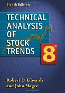
Technical Analysis of Stock Trends by Robert D. Edwards and John Magee – this is without a doubt the bible of Technical Analysis. It’s a must read for anyone who takes this market seriously.
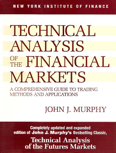
Technical Analysis of the Financial Markets by John Murphy – for me this is the most easy to read and easy to understand books in the history of technical analysis. I would suggest reading this one first, before getting into Edwards and Magee. But you have to read both.

Japanese Candlestick Charting Techniques by Steve Nison – Everything that you need to know about Japanese Candlesticks, their history and how to use them is in this book. Steve Nison is credited with first bringing these eastern techniques to the western world.
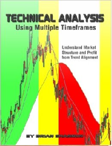
Technical Analysis Using Multiple Timeframes by Brian Shannon – this was the first book on technical analysis that I voluntarily read after completing the CMT program. I think the way he explains how to benefit from using more than just one timeframe is the perfect compliment to all of these other books.
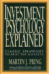
Investment Psychology Explained by Martin Pring – I’ve read this one 3 times. It’s a very interesting book with a lot of cool history. He talks about the tulip and south sea company bubbles. I really enjoyed this one. It’s much more of a beach read than the others.
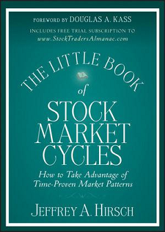
The Little Book of Stock Market Cycles by Jeffrey Hirsch – One of the most valuable tools we have as technicians is seasonality. Jeff who also writes the annual Stock Traders Almanac, which you also need to buy every year, is the official authority on this subject.
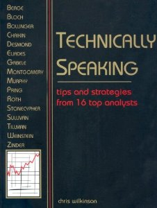
Technically Speaking by Chris Wilkinson – this is basically the technical analysis version of the Market Wizards series by Jack D. Schwager, which I also recommend reading. Wilkinson interviews technicians from the past including guys like Stan Weinstein, John Murphy, Martin Pring and Phil Roth.

Intermarket Analysis: Profiting From Global Market Relationships by John Murphy – I am such a John Murphy disciple. Him and I look at markets in a very similar way. I saw him give a presentation recently and I promise you, had he gotten stuck in traffic, I could have stepped in and done the presentation for him. He has influenced a lot of my work and I recommend reading all of his books. You can also subscribe to his market message on Stockcharts.com – which I’ve been doing since 2005.

Elliott Wave Principle by A.J. Frost and Robert Prechter – This is everything you need to know to start counting waves. The Fibonacci concepts are explained here very well. I really enjoyed this book. Even if you’re not or don’t want to be a hard-core Elliotician (I’m not one), sometimes these waves really stick out and provide incredible risk/reward opportunities. Knowing these principles is a huge advantage.
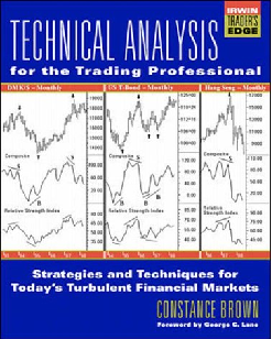
Technical Analysis For The Trading Professional by Connie Brown – The relative Strength Index (RSI) is something that I incorporate into my work every single day. This book helps you to think outside the box and explains how to manipulate different oscillators so you get signals that others wouldn’t because they use default settings. This one really gets your mind going in ways that other books simply do not.
***
And that’s my list.
Gain Full Access Now
Chart Construction
John Murphy said it best:
Remember that the chart only records the data. In itself, it has little value. It’s much like a paintbrush and a canvas. By themselves, they have no value. In the hands of a talented artist, however, they can help create beautiful images. Perhaps an even better comparison is a scalpel. In the hands of a gifted surgeon, it can help save lives. In the hands of most of us, however, a scalpel is not only useless, but might even be dangerous. A chart can become an extremely useful tool in the art or skill of market forecasting once the rules are understood.
What Do All Of These Letters And Numbers Mean?
The first thing we want to do is determine what all the numbers and letters represent. As you can see here, the y-axis is the vertical data set on the right representing price. The x-axis is the horizontal data set on the bottom representing time. As time goes by, the chart is plotted to the right of the previous period.
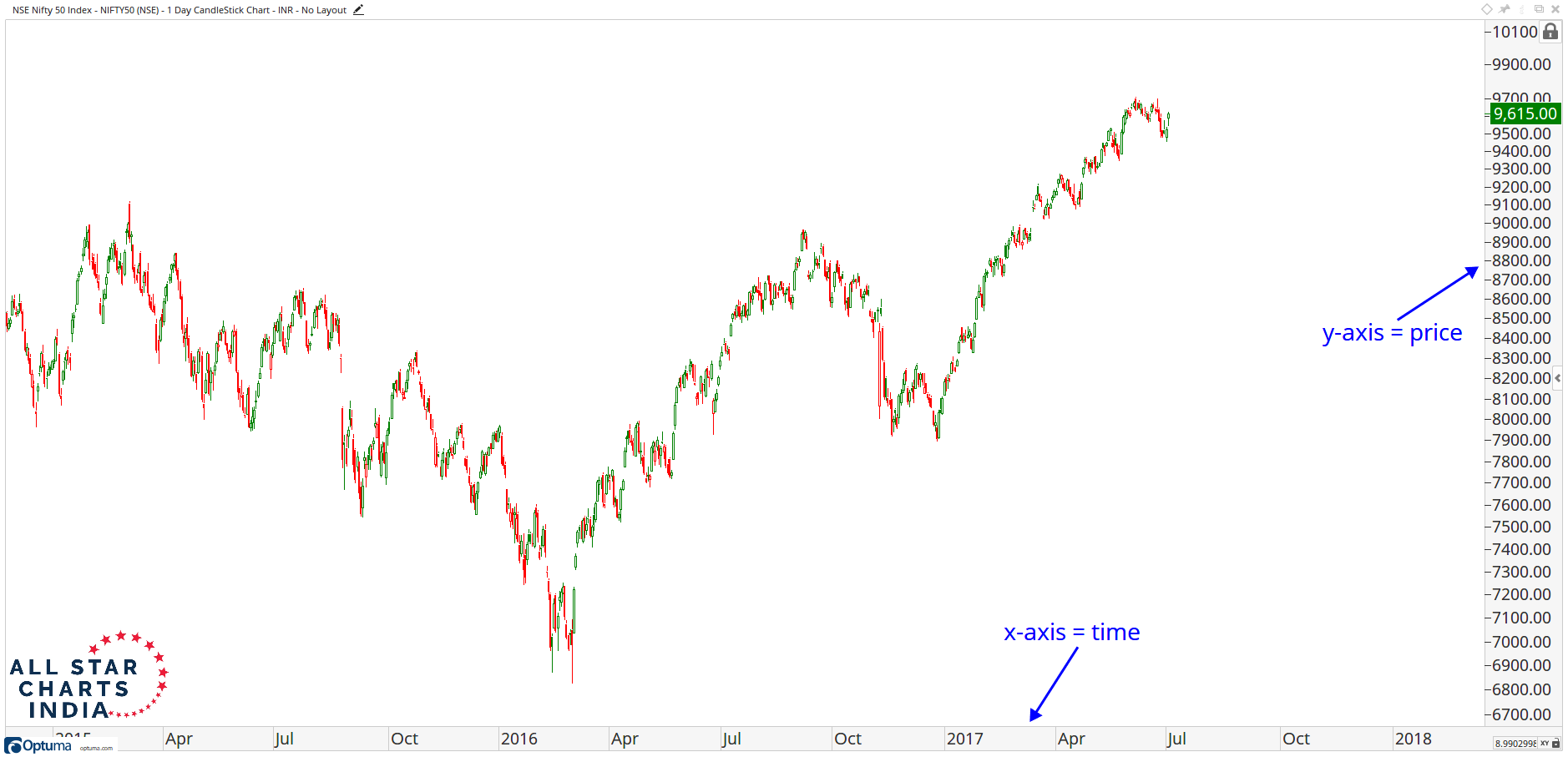
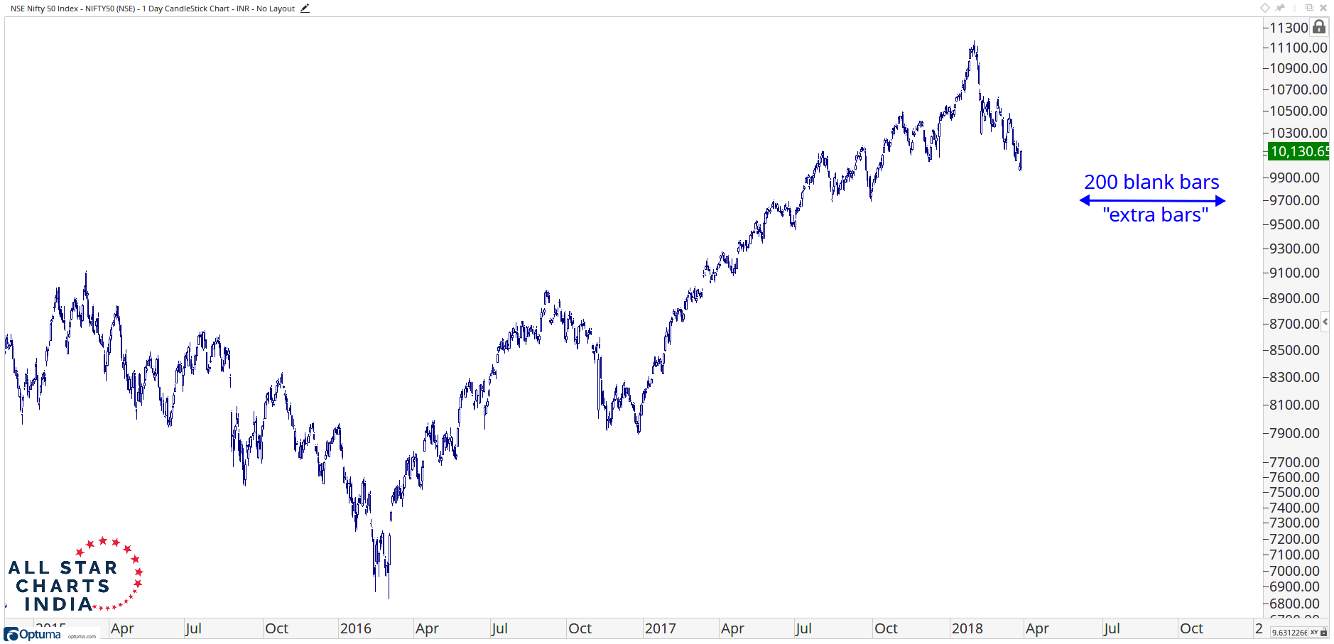
Notice how I leave room between price and the y-axis. This is done purposely to allow for a visible area to determine the direction of the next price movements. These are called “Blank Bars” or “Extra Bars”. Look at a chart without any extra bars:
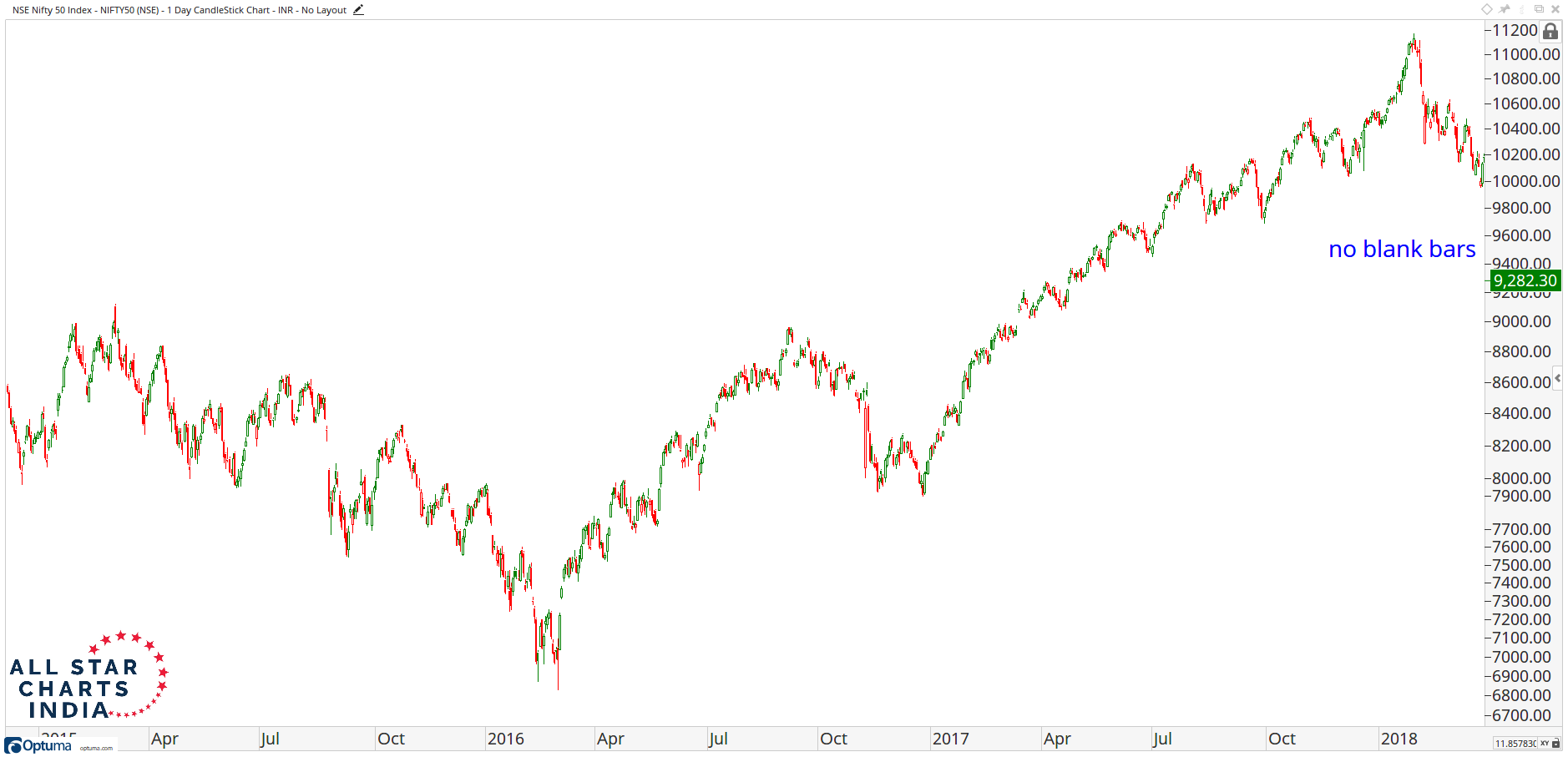
Doesn’t this one look so much better? It allows you to visualize the future progression of the trend:
Arithmetic vs Logarithmic Scale
Next, I’d like to discuss the differences between a semi-log chart and an arithmetic scale chart. When you are using an arithmetic scale chart, you are visualizing price in a linear format. This is traditional when looking at say, time and temperature. In this linear case that we refer to as an arithmetic scale represents absolute price changes. So the vertical distance between $5 and $10, although a 100% move, appears the same on the chart as the vertical distance between $50 to $55, which only represents a 10% move.
Semi-log charts show the logarithmic scale on the y-axis. These are therefore sometimes referred to as “Percentage Charts”. The vertical distance between $5 and $10 is the same as $50 to $100 since both represent a 100% move in price.
Logarithmic Chart
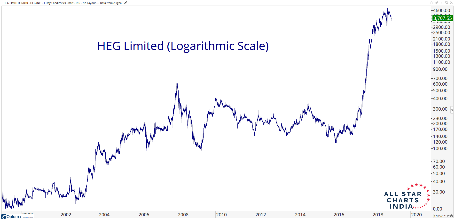
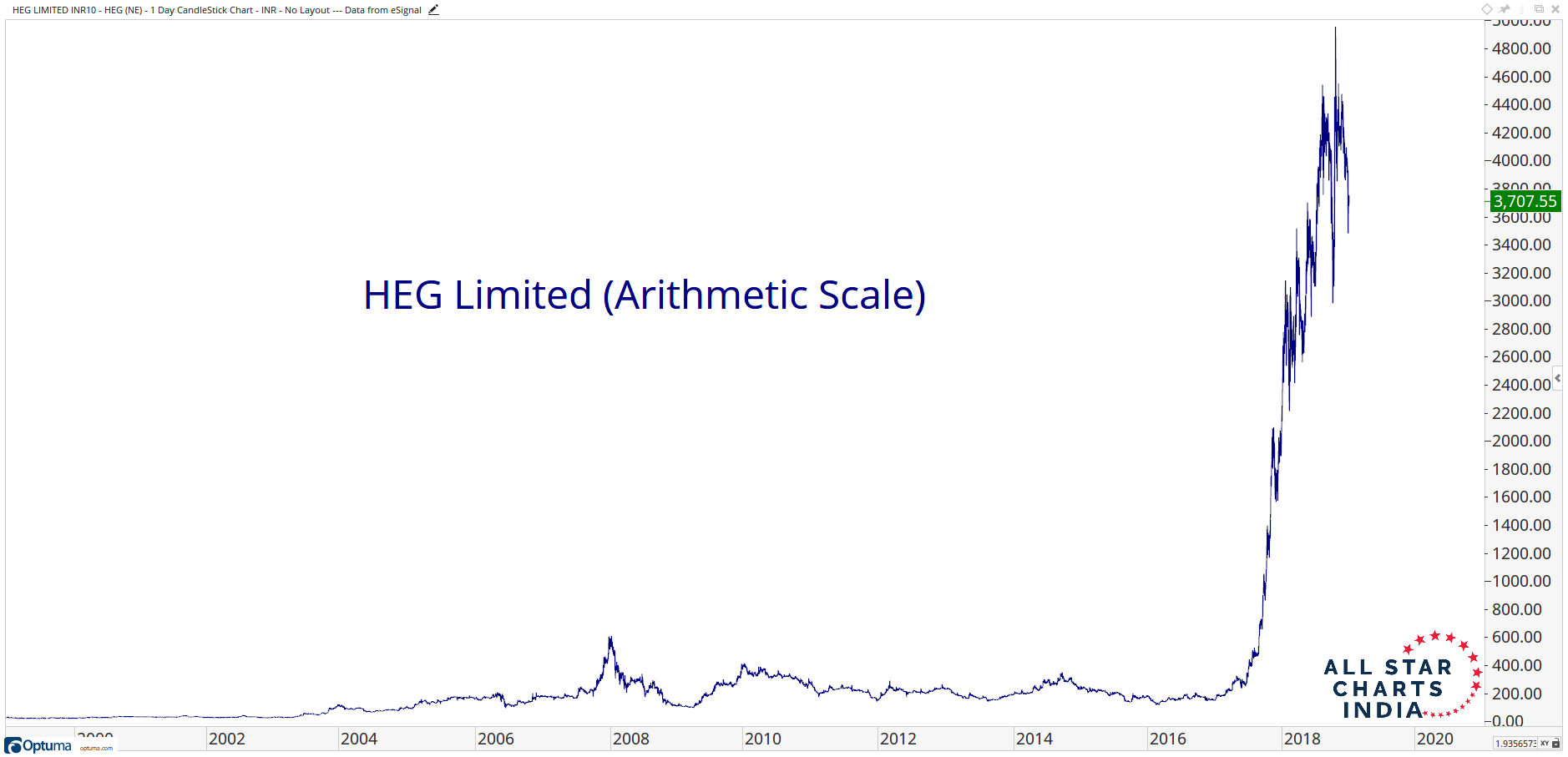
Here is a good example of HEG Limited, using a logarithmic scale. Look how the price changes closer to the bottom of the y-axis are much further apart than the price figures near the towards the top. This is because the logarithmic scale shows percentage changes
Arithmetic Chart
Here is the same exact chart as above but except using an Arithmetic price scale. Below is the Arithmetic scale, or linear chart format. Notice how you barely even see the price changes in 2008-2009. How much better is it on a logarithmic scale? You can actually see what happened in 2008-2009 (and the periods before and after it). You see the problem with the linear charts using an arithmetic scale is that they improperly exaggerate the top end of the axis, but hide valuable information towards the lower end.
Supplementary Material Comparing Methods
I prefer to use Logarithmic charts as the default. This is especially the case for long-term charts with a lot of data on it and for charts that have very wide swings in price from high to low. I had the opportunity to interview one of the Founding Fathers of the Market Technicians Association Alan Shaw about this very subject. I definitely recommend watching this. He spent 46 years as an analyst on Wall Street so he talks about some pretty old school stuff. I think you’ll appreciate his perspective on things: Alan Shaw & JC Interview.
He makes a great point during the interview that for Day Traders Log-scale charts are irrelevant. They’re trying to make points on a stock. But for any kind of intermediate or long-term perspective, logarithmic scale charts are not only incredibly valuable but a necessity. How else can we really get the real perspective on the direction of the primary trend?
Over the years I’ve been lucky enough to become friends with some of the smartest technicians in the world. One time I reached out to them to hear their thoughts on the subject of Arithmetic vs Logarithmic scale charts. You can read that here: Arithmetic vs Log.
Using Multiple Timeframes
We always want to incorporate multiple timeframes in our analysis. This is part of the top/down approach. First, we start with a longer-term view, formulate a thesis, and then work our way down to a shorter-term timeframe. The first thing you need to do is define your time horizon. Are you swing trader looking at 30-minute and 65-minute charts? Or are you a longer-term investor looking at weekly and monthly charts? I personally look out weeks and months at a time, so I use a daily time frame. Therefore I need to go one level higher to get my longer-term view, so I use weekly charts. If you are a day-trader, you can use daily charts to get a longer-term perspective on price levels. If you’re a longer-term investor looking at weekly charts, you can go further and look at monthly charts to get a longer-term perspective. The whole idea is to use multiple timeframes, preferably no more than 2 or 3.
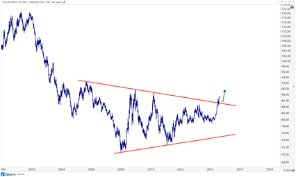
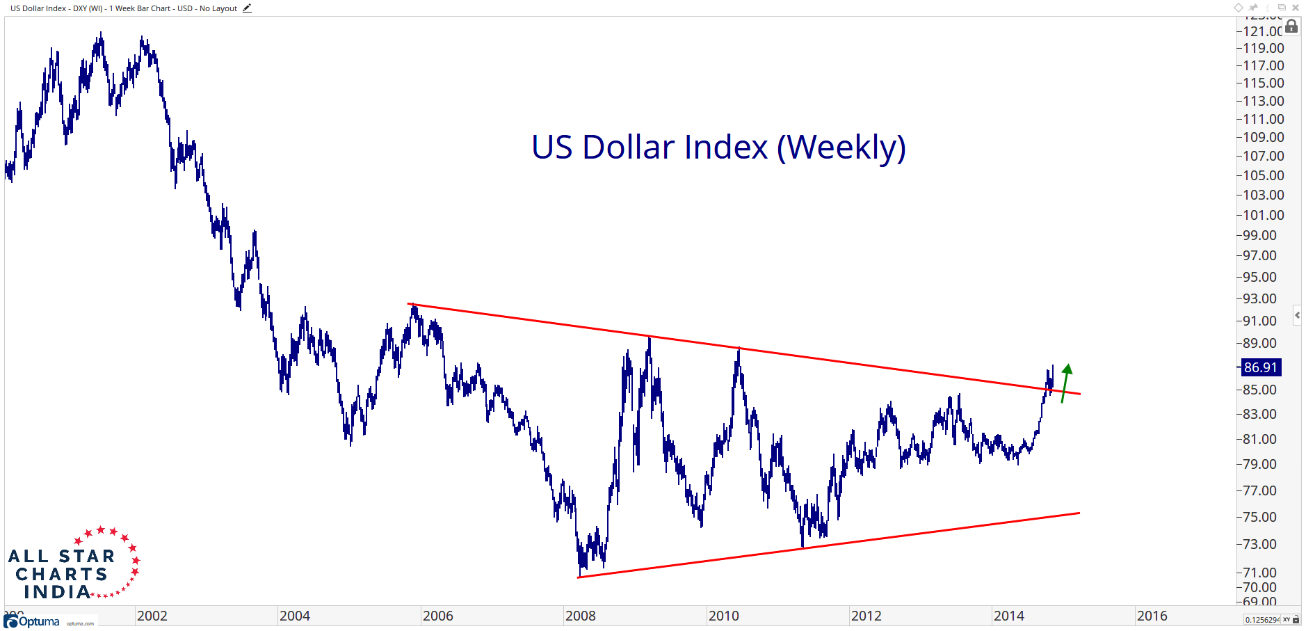
So here we’re looking at the US Dollar breaking out in 2014 above a downtrend from the 2005 highs. We look to this as a bullish development and US Dollars are coming out of a huge base.
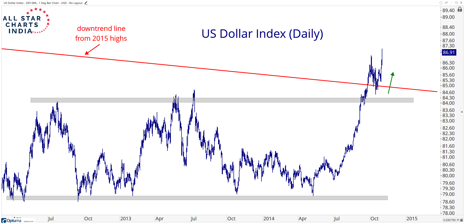
Then you work your way down to the daily timeframe and see the US Dollar not only breaking out above that downtrend line shown above but actually coming out of a shorter-term range as well between 79 and 84. Both timeframes are showing bullish developments.
Incorporating multiple timeframes is a vital part of my process. I would encourage everyone to regularly take a step back and take a look at the markets you’re focused on but from a bigger picture perspective.
I asked my friend Brian Shannon @alphatrends, who originally inspired me to consistently use multiple timeframes in my technical analysis, to send you guys a personal message about the subject. Here is what he had to say:
Multiple time frame analysis gives you an opportunity to “see inside” a larger trend to improve your timing which means less risk and better profit potential.
Using a minimum of three time frames (in this example for swing trades) we would;1- IDENTIFY THE OPPORTUNITY on a long term chart (200 days or more) to identify the bigger trend.2- ANTICIPATE ENTRY on the intermediate term trend (generally 30-50 days using 30 or 65 min time frame) to establish our risk/reward.3- PARTICIPATE (BUY OR SELL SHORT) on a shorter term time frame (10-15 days using a 15 minute time frame or lower) to fine tune our entry.Multiple time frame analysis can (and SHOULD) be used for any market participant, regardless of your time frame!
 I think Brian explains this concept perfectly. He has a shorter time horizon that I do, but the psychology is exactly the same. We want to work from the top and work our way down. I like starting 10-20 years back, then working our way to what is happening the past couple of years and finally to the past few quarters. This helps identify the direction of the primary trend and can put us in a position to trade in the direction of the long-term, intermediate-term, and short-term trends. Having all that wind behind us is a huge advantage. Without using multiple timeframes, it becomes impossible to do that.
Price-Only vs Dividend-Adjusted Charts
There is no easy answer in Technical Analysis. This isn’t science where 2 + 3 always equals 5. Or force = mass x acceleration. I’ve always considered what we do as more of an art. Howard Lindzon calls it “Chart Art”. Others call it Data Visualization. Whichever nomenclature you prefer, it doesn’t change the fact that you can ask 10 technicians a question about a stock and get 10 different answers.
In my experience, price is what pays. We remember what we paid for it, not how much money we’ve made or lost. It’s not the total return we’re concerned about when it comes to supply and demand dynamics, it’s the absolute price. So while a few people like to adjust their charts for dividends, I choose not to. I want to look for absolute levels of support and resistance, not distorted ones.
That’s how I construct my charts!
Gain Full Access Now
Intro to Technical Analysis
If our primary concern is price, because that is the only thing that pays, then our analysis should start and end with the study of price. This is the basis of Technical Analysis and in these short lessons, we will discuss how to construct a chart, how to analyze what is displayed on the chart and a little bit of background history to help put what we do into historical context. These lessons will prepare you for the more advanced modules where we get into Technical Analysis in practice.
What is Technical Analysis?
History of Technical Analysis
One reason I decided to start this blog in the first place was to clear up a lot of the misconceptions about technical analysis and behavioral finance. Before getting into more detail, I think it is important to define what technical analysis even is and explain what some of the differences are between technical and fundamental analysis in the market. Throughout this platform I use the word “Market” interchangeably to describe all liquid capital markets including the Stock Market, Interest Rates, Commodities and Currency Markets. The principles discussed here can be seen across each of these asset classes on both short-term and longer-term time horizons.
In 1948 Robert D. Edwards and John Magee wrote what today is considered “The Bible of Technical Analysis”. Technical Analysis of Stock Trends is the most influential book written about the process of interpreting the predictable nature of markets and the investing community. In this book, Edwards and Magee defined Technical Analysis as, “The Study of the Action of the Market Itself, as Opposed To the Study of the Goods in which the market deals”. A lot of what Edwards and Magee wrote about in 1948 derived from the writings of Charles Dow over 60 years prior to their publishing.
Charles Henry Dow, who is widely considered to be the Father of Technical Analysis was the co-founder of Dow Jones & Company along with a gentleman by the name of Edward Jones. Although he was born and raised in Connecticut, Charlie got a job as a newspaper reporter in Springfield, MA when he was 21 years old. He wanted to write about companies so he would visit them to ask questions. Since there was no Securities & Exchange Commission at the time (the SEC was created in the 1930s), companies were not forced into answering the questions. “My business is none of your business”, they would tell him. But Charlie was aware enough to see big money moving in and out of stocks.
Charlie realized that the majority of the securities of established companies tended to go up or down in price all together. Stocks that went in the direction against the financial tide were few and far between. It was rare for a stock to move counter-trend to the overall market for more than a few days. If markets were going up, a large majority of the securities would rise, and if markets were falling, stocks would generally fall together. Although there were some instances where some stocks would rise faster than others in good times, and some would fall more rapidly than others during bad times, the point was that the direction of these trends coincided with the direction of the entire group. This was the case then and still is the case today.
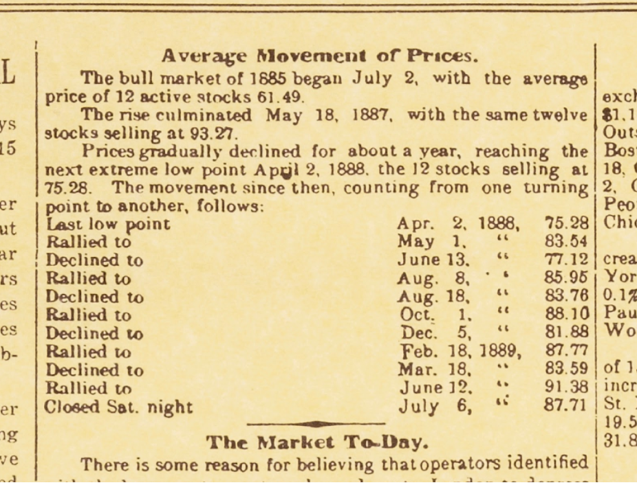
Charlie recognized that there were two groups of companies that ran the economy. You had the companies that made the products, the producers, and you had the companies that hauled those products, the railroads (Remember this was just after the civil war, so it was just the railroads that moved products. Today we have other methods of delivery). In the 1880s, Charlie decided to create two averages: The Dow Jones Industrial Average and the Dow Jones Railroad Average. The original Industrial Average included just 12 issues, which was later increased to 20 in 1916 and eventually to 30 in 1928 (although the components have changed since then, the number of issues has remained the same). The other was the Railroad Average, which consisted of 20 Railroad companies and were some of the most dominant companies of their day.
Here is a photo of the first edition of the Wall Street Journal in 1889 where Charles Dow started recording prices changes in a column titled “Average Movements of Prices”:
Since the mid- to late-90s, technical analysis has gone from hand-drawn charts to more sophisticated computer-based charting software. I’m lucky to start my career after computers had already taken the role of plotting price and price derivatives like momentum oscillators and smoothing mechanisms. But prior to computers, these charts were created by hand with price data that was calculated daily.
Here are legendary Technician Ralph Acampora’s hand-drawn charts from the 1970s that I found one day visiting some friends at the old Market Technicians Association headquarters on Broadway in New York City:
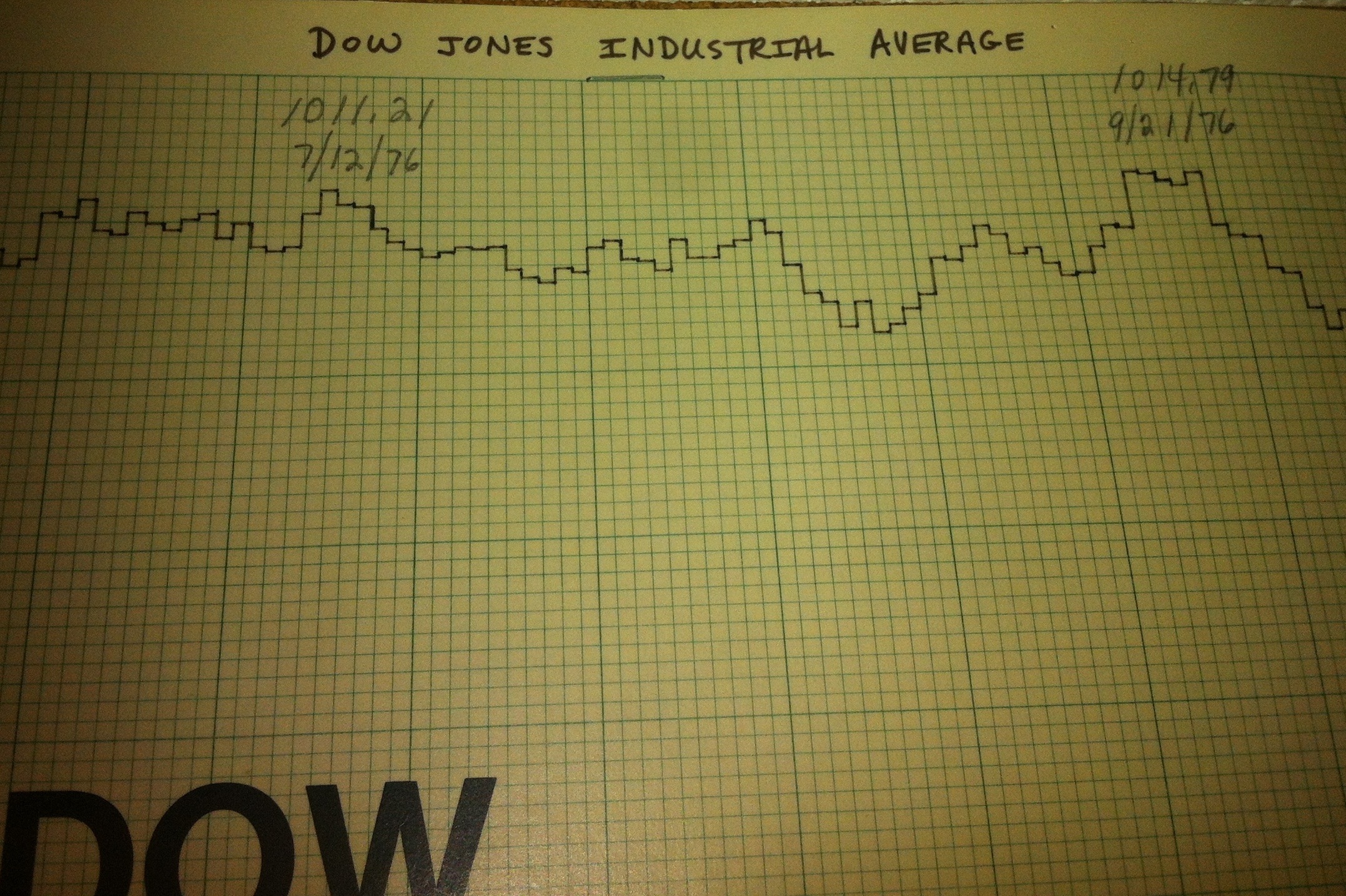
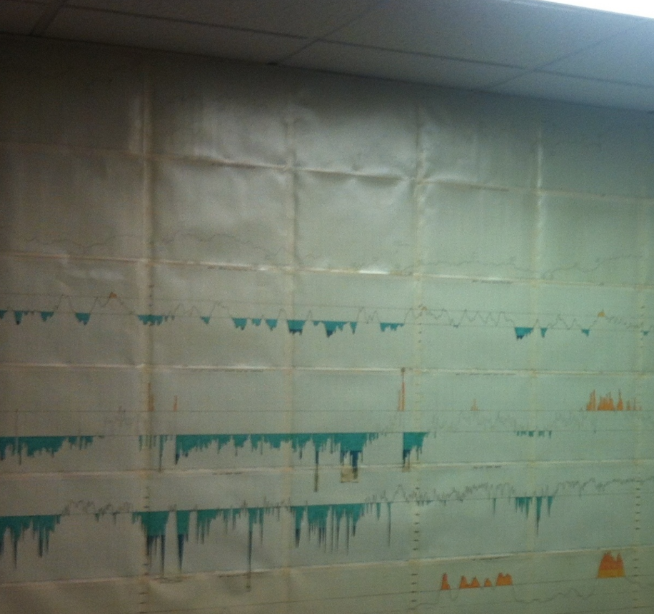
Technicians are often associated with charts or chart analysis. But it’s not so much that the charts tell you what to buy and sell, it’s just that technical analysis studies the changes in equilibrium between supply and demand. So it just so happens that the best way to visualize these changes in equilibrium is in chart form. This is why you’ll see many charts throughout this research platform.
Some of the smartest people in the past few hundred years have attempted to master the market and have failed miserably. The profits that one can achieve from successful market participation are enormous. So it should not be surprising that world-renowned analysts and even Nobel Prize Winners have tried and failed at market speculation. Granted, there have been many success stories along the way, but they are the exception, not the rule. They put in their 10,000 hours, as Malcolm Gladwell so eloquently put it in his book Outliers.
To really get a good understanding of the principles behind technical analysis, I think it’s important to be clear about the philosophy and psychology behind the supply and demand dynamics that make technical analysis possible in the first place.
Markets Trend
An important concept that needs recognition is that markets trend. There is a much higher likelihood for a market trend to continue than there is for it to reverse course. If a market is trending higher, there is a much much greater chance that it continues to rise, than for it to start a new downtrend. Same thing in a downtrend. If prices are falling, there is a higher chance that they keep falling, or keep underperforming, than for it to reverse and start a new bull trend.
Throughout this research platform, we’ll use various tools that we have at our disposal to help us recognize that a trend may be changing. These range from momentum tools to sentiment, to simple pattern recognition. But changes in trend are often a process. Remember that prices are driven by large institutional fund managers that move billions and billions of dollars each day. Changes in trend are therefore more of a process, not an event. Think of it like a cruise ship. These massive vessels can’t just reverse course at the press of a button. It takes time and there are certain characteristics that can be recognized as the turning is taking place. The market behaves in a similar fashion.

These changes in trends are reflections in the changes in supply and demand dynamics, which are driven by human nature. The terms Fear and Greed are two extremes in human psychology that help drive these changes in equilibrium between supply and demand. Regardless of whether these are humans entering buy and sell orders, or algorithms built by humans to buy and sell, these actions still reflect the fear and greed mentality that is inside the human brain. Therefore, for hundreds of years, this behavior can be visualized through patterns in price charts that are repeated over and over again. Markets might change over the years in terms of how we execute, or perhaps the economic or political environment during different years, but at the end of the day, humans are still the same and human emotions are what drives price. This is why the behavior of the market does not change. This is also why patterns in price we see today can be identified in price charts 100 years ago. I’m willing to bet these same patterns will be seen in price charts 100 years from now.
Technical Analysis vs Fundamental Analysis
Technical Analysis focuses on the behavior of the market. We try to answer the questions “What?”, “When?” and “For How Long?”. Fundamental Analysis, on the other hand, concentrates on the reasons that drive the changes in Supply and Demand, trying to answer the question, “Why?”, if you will. The fundamentalist looks at forces that theoretically drive supply and demand such as company and economic factors.
Both of these forms of analysis try to answer the same question: In which direction is the market heading, higher or lower?. The fundamentalist takes all known information and calculates what he/she considers to be fair value for a security. If prices are below that “fair value”, then the security should be bought. If prices are above that “fair value”, then the security should then be sold.
The problem I have with this approach is that the data that it uses to calculate this “fair value” for a security is removed from the market dynamics themselves: the supply and demand the drives the direction of price. The analyst, therefore, has to assume that there is direct causality between these outside data points and the movements of the market itself. This assumption is an inherent flaw in this form of analysis. The fundamental analyst first has to come up with a forecast for certain events and outcomes to these events, which is an estimate in itself. Then, the fundamental analyst has to come up with a conclusion as to how the market will react to these “forecasted events”. There are multiple steps involved here that are based off an assumption that is clearly false: that specific outside events directly impact the movement of securities. We know that it is supply and demand that drives price. So the number of assumptions taking place in this multi-step process, in my opinion, is a recipe for disaster. Technicians, therefore are at a huge advantage in that there is just one step involved.
These fundamental factors mentioned above, without questions, play a part in the supply and demand dynamics for a given security. Another inherent problem with this, however, is that there are many other factors involved that determine whether there will be more supply than demand or vice versa. The fundamental analyst must then assume that he or she is factoring only the correct data points in the fair value equation. The problem is that the price of a given market reflects the opinions of all of these analysts but also weighs in the moods of market participants, the fear and greed if you will. As much fundamental homework that is done to determine a potential fair value, it is mathematically impossible to quantify the additional factors that determine where buyers and sellers will agree on for a security to exchange hands at an agreed-upon price.
As technicians, we approach the market knowing, with complete justification, that all known information, including what the fundamental analysts are opining on, is the reason that price is where it is. The market is forward-looking by nature. It is factoring in outcomes for events that have not yet taken place. The market is a smart discounting mechanism and this is why technicians focus on the behavior of the market itself, rather than the forces that may or may not impact it. As a market participant, would you prefer to focus on the cause or the effect? The fundamentalist spends time trying to find the cause, while the technician has the facts and looks for the most probable effect. Technicians do not believe that knowing the cause is necessary for determining the effect.
To put it another way, if price factors in all known information, including everything that fundamental analysts focus on, then by definition, technicians who study price are also factoring in the fundamentals of a given security. If you had to choose one method of analysis, which would it be? Would you be a technician who studies price, or would you go the fundamental route and focus on the causes of movements, blatantly ignoring the only detail that actually pays: price. Remember, fundamental analysis does not take price behavior into account.
The concept of paying one-hundred-and-something times earnings for any company for me is just anathema. Having said that, at the end of the day, your job is to buy what goes up and to sell what goes down so really who gives a damn about PE’s?” – Paul Tudor Jones
The Benefits of Technical Analysis
One of the biggest advantages of technical analysis is the ability to apply its principles and philosophy to markets of all kinds. Whether a participant is trading stocks, ETFs, Futures, etc, the supply and demand dynamics remain exactly the same. In addition, technicians can focus on all sectors and different types of stocks in a given market. With the amount of data that would need to be digested to make fundamental conclusions in a given security, it is impossible for the fundamental analyst to be an expert on all things. Therefore fundamental analysts tend to specialize in a given sector or part of a market. The technician is open to anything and everything that is liquid.
This is where opportunity cost comes into play. If there is a given sector or group of stocks where there is a lack of trend, say Emerging Markets throughout 2011-2014, a fundamental analyst focused on that space is missing out on opportunities elsewhere. As a technician who follows price, these range bound markets lacking a direction in trend are a place to shy away from. During different times of the economic cycle, certain groups of stocks tend to do better than others. There is always a group of stocks where momentum is driving them higher while another group is simultaneously dormant. The ability for a technician to focus his or her attention only on the most actionable markets is a tremendous advantage. The technician is free to pick and choose what countries to be in, what asset classes to be trading, and more specifically how to take advantage of them: through equities, futures, ETFs or even options for hedging and/or leverage purposes.
Timing-wise, the technician can apply their principles to all time frames. The market is what we call, “Fractal”. Whether we are looking at a chart using weekly timeframes, or a daily chart, or even intraday patterns, the supply and demand dynamics remain the same. As a result, the technician can also apply multiple timeframes to the analysis. The top/down approach looks at a larger time frame, say weekly bar charts, to get a more structural perspective, and then the technician can work down to say a daily bar chart for more tactical execution strategies. There is a common misconception out there that Fundamental Analysis is for the long-term while Technical Analysis is for the short-term. This is a blatant lie. The truth is, the larger the time horizon, the more reliable our technical techniques tend to be. The shorter the time horizon, the more whipsaws, or ‘failed moves’, we’ll see.
Price leads market fundamentals. The reason is that as a leading indicator and forward-looking mechanism, the market not only prices in all known information, but also factors in unknown fundamentals that have yet to be seen. Some of the most dramatic bull and bear market throughout history began well before any serious changes in fundamentals could be seen. A fundamental thesis may take months or years to play out. As market participants, we do not have the time to let things, “play out”, particularly with the leveraged nature of the futures and forex markets. A 20% drawdown in a position in these markets, while a participants wait for fundamentals to price themselves in, is likely to wipe out the entire account balance for that person before a given thesis plays out fully.
I have found a tremendous amount of value in focusing on Technical Analysis and avoiding the fundamentals completely. I almost feel like the less about the company, the better. I’m human too you know. I have emotions as well. So the more I can avoid anything that makes me biased towards something, the better off I’ll be. This method may not be right for everyone. But I think we can all agree that Technical Analysis is the most valuable tool we have as market participants.
Technical Analysis is the most valuable way to look at the market……If what we are principally concerned with is price, then why wouldn’t we start and end with the study of price – Josh Brown @reformedbroker
Gain Full Access Now
- « Previous Page
- 1
- 2
- 3
- 4
- 5
- 6
- …
- 10
- Next Page »