This is the video recording of the April 22nd Town Hall Meeting w/ Willie Delwiche
04/22/21 2PM ET [Read more…]
Expert technical analysis of financial markets by JC Parets
This is the video recording of the April 22nd Town Hall Meeting w/ Willie Delwiche
04/22/21 2PM ET [Read more…]
From the desk of Willie Delwiche.
Key Takeaways:
The word perspective has multiple definitions. The dictionary we have at our house lists eight. For me, the most relevant of those have to do with seeing the interrelationships of relevant facts and ideas as well as those that deal with distant time frames & horizons.
When it comes to investing, keeping perspective is the difference between success and failure. A successful approach to portfolio management can be built on a sturdy three-legged stool of perspective focusing on:
We need to keep in mind how we are making sense of incoming information, how our preferences are changing in light of that information, and how far out in the future we are looking when it comes to how we are positioning our portfolios. When we lose track of any of these, the stool topples and the noise of the market can crescendo to a deafening din. This seems especially to be the case in the current environment, which offers many compelling arguments that reach starkly different conclusions.
Readers of All Star Charts research are no doubt familiar with the team’s focus on relative strength. They are often comparing sectors against each other to uncover where hidden strength (or weakness) is hiding out. It’s one thing to see how a stock or a sector is performing on absolute — dollar and cents — terms. But seeing how investors favor one sector versus another offers important insight into how the marketplace is perceiving risk and opportunity.
This analysis often forms the bedrock of our best discoveries.
[Read more…]
From the desk of Steven Strazza @Sstrazza and Ian Culley @Ianculley
Last week, we highlighted the USD testing a critical level against the Rand. This is a theme we’ve been seeing a lot in a variety of USD crosses recently and will discuss more in a post later this week.
We’re finally beginning to see some resolutions from these key levels, and they’re revealing some very valuable information regarding the Dollar’s strength and the likely future direction for the $DXY Index itself.
In this post, we’ll take a look at some examples of this theme by showcasing two forex pairs from Northern Europe that are currently breaking down at major inflection points against the USD.
But before diving in, let’s set the stage a bit…
From the desk of Willie Delwiche.
Key takeaway: The heat has been turned up on our sentiment indicators, and optimism is back to a full boil as we see indexes in the US and around the world move to new highs. While it takes bulls to have a bull market, sentiment running too far ahead of reality can be a recipe for some churn. While breadth remains strong and economic & earnings data comes in ahead of expectations, investor optimism may well be rewarded. If breadth falters in a meaningful way and/or incoming data starts to fall short of expectations, the overheated sentiment backdrop would pose an increased burn risk. Investors who can’t tolerate the heat might want to step out of the kitchen for a breath of fresh air.
Sentiment Report Chart of the Week: New Highs Across the Board
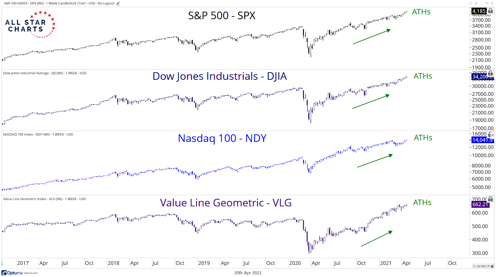
Large-cap US Indexes registered new, all-time highs last week as breadth slowly rebounds after a period of digestion. Optimism may be running hot, but at least it’s producing bull markets.
From the desk of Steven Strazza @Sstrazza and Ian Culley @Ianculley
Check out our latest Mystery Chart!
What we do here is take a chart that’s captured our attention, and remove the x and y-axes as well as any other labels that could help identify it.
This chart can be of any security, in any asset class, on any timeframe. Sometimes it’s an absolute price chart, other times it’s on a relative basis.
It might be a ratio, a custom index, or maybe the price is inverted. It could be all three!
The point is, when we aren’t able to recognize what’s in front of us, we put aside any biases we may have and scrutinize it objectively.
While you can try to guess the chart, the point is to make a decision…
So let us know what it is… Buy, Sell, or Do Nothing?
From the desk of Steve Strazza @Sstrazza
This weekend was the 5th Annual Chart Summit. It was a blast (as always) and all the footage will be archived and available for anyone to rewatch soon!
My presentation this weekend was about all the various “bottoms-up” scans we run here at All Star Charts… including Under The Hood, of course.
Therefore, I wanted to spice things up for viewers and share some additional names outside of the usual bi-weekly report.
So I summarized two bonus setups during the conference (which you can watch in the videos, available soon) and I’ll outline them again below.
Let’s dive right in.


